01
Phase one
Find out what is really there
An audit of every page, every template and every redirect before a line is written.
Cards that pin one after another and stack up as the page scrolls. The card underneath shrinks and dims by an amount you set, so the pile reads as depth. Card height, the step between them and every colour are fields.
Full-height cards
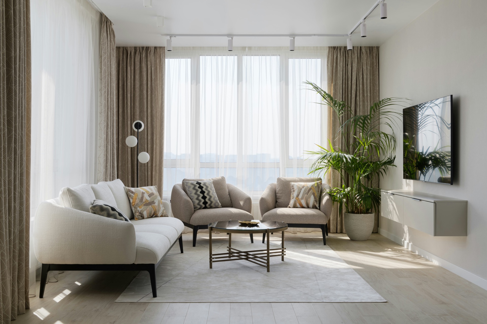
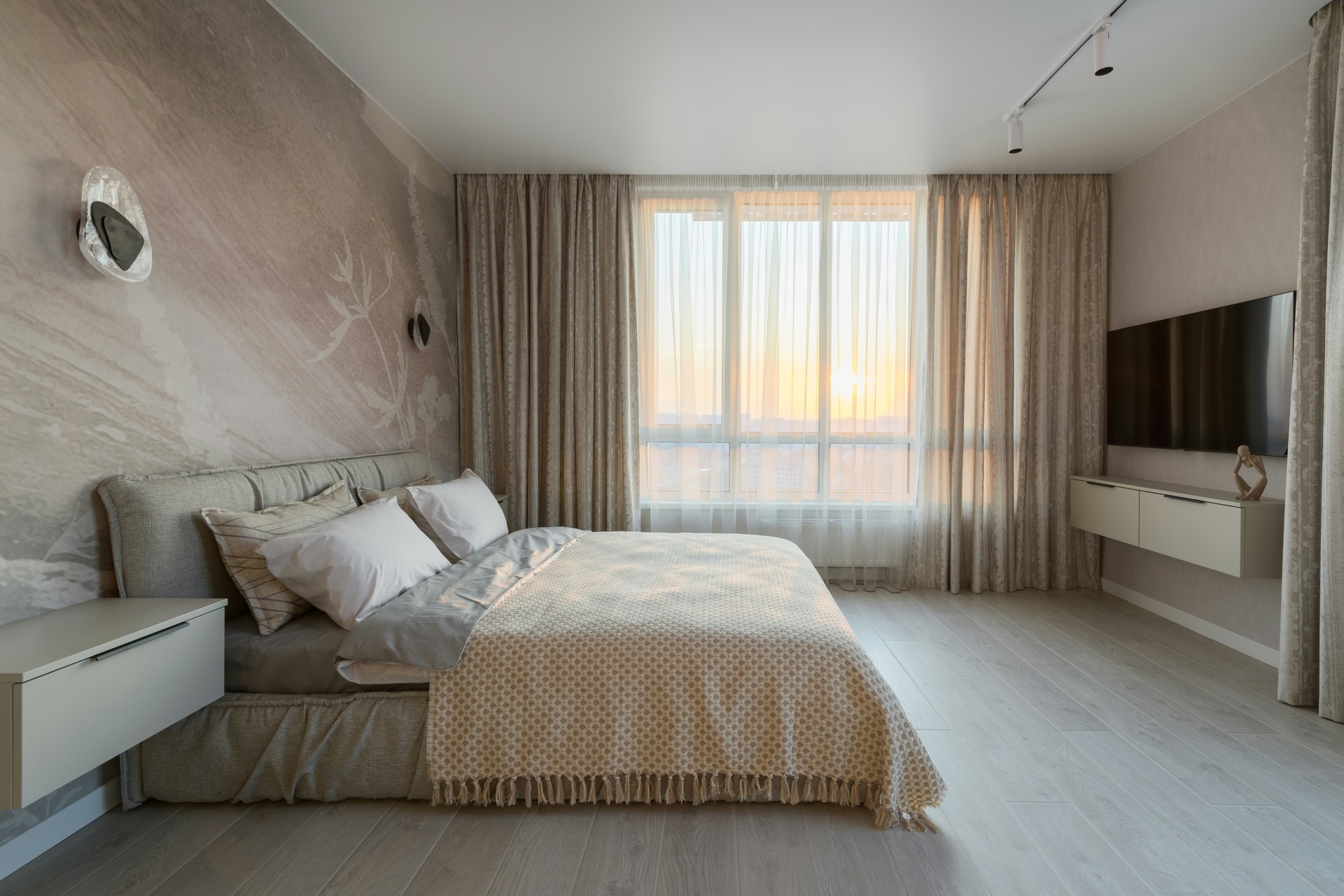
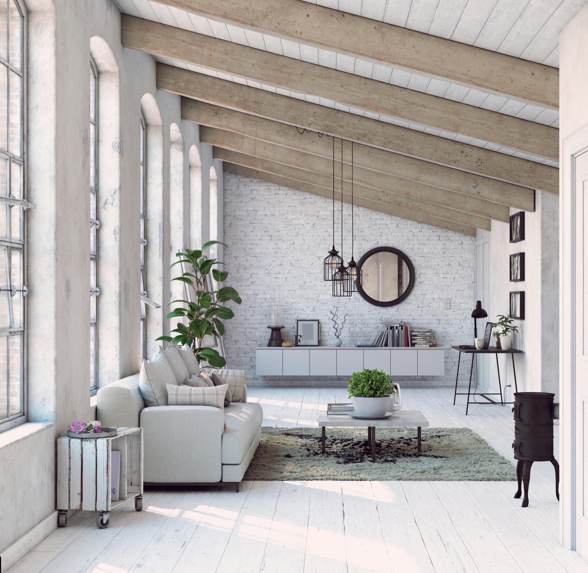
Each card holds a photograph or a looping video behind its text. As the next one rises, the one below shrinks slightly and slides under it. The whole card is a link, marked with an arrow in the corner.
How it runs
Scroll and each phase comes to rest on the one before it.
Phase one
Phase two
Phase three
Every value an editor might need becomes a field.
Phase four
Text cards
Cards with no media hug their content. A smaller step and a lighter shrink keep the pile compact, and progress reads as a counter instead of dots.
Picture cards
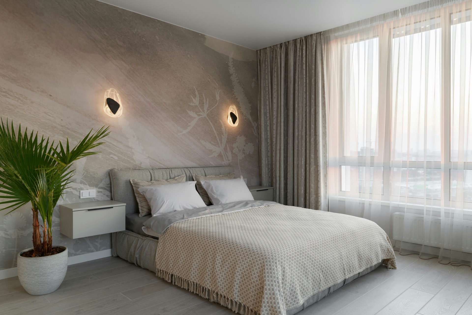
Media can sit above the text rather than behind it, running to the card edges. One of these cards holds a looping video in place of the picture.
Reception
Film
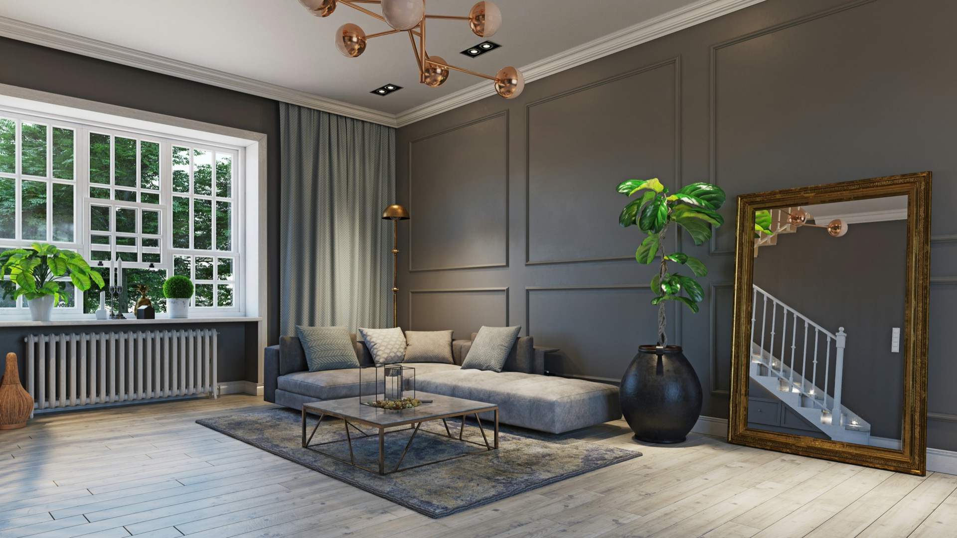
Bedroom
Add the module. Drag Sticky Stack Pro onto a page. It renders with sample cards you can scroll straight away, so you can feel the movement before writing anything.
Write the cards. Open Cards. Each entry takes an eyebrow, a title, rich-text body, a badge, media and a link. Everything except the title is optional, and anything you leave empty is left out of the markup rather than rendered as a blank line. Add up to sixteen and drag to reorder.
Set the card height. Under Motion & Behaviour, card height is how much of the screen one card fills while it is held, in vh. Around 70 leaves room to see the next card arriving; 90 fills the screen and reads as a deck. Cards are exactly this height, so content never pushes one out of view.
Set the pin offset. This is where the first card comes to rest, measured from the top of the window. If the host page has a sticky header, use its height plus a little breathing room.
Set the step. Each card rests slightly lower than the one before it, so the top edge of every card already in the pile stays visible. Larger steps show more of the stack; smaller steps keep it tight. Multiply the step by your card count and keep the total under the space you have.
Set the depth. Shrink and dim control what happens to a card once it is covered. Both accumulate: a card with three cards on top of it has shrunk three times, which is what makes the pile recede rather than just the top pair changing.
Style it. Every value on the Style tab is a field. Fonts and the accent colour inherit from your HubSpot theme until you override them.
Each card is held with sticky positioning at a rest point of its own, and the next card scrolls up over it. Nothing is intercepted and no spacer is inserted: the height being scrolled is the cards' own height, so the length of the page still matches the content on it.
Because the scrolling stays ordinary, the browser's scrollbar, keyboard scrolling, find-on-page and the back button all behave the way a reader expects, and stopping half way leaves the stack exactly where it was.
There is no animation library. Shrinking and dimming are applied with a transform and a filter, both of which stay off the layout path, so a long stack does not cost layout work on every frame.
Cards are a repeater, so an editor adds, removes and reorders them without touching a template. Each one holds:
Card content sits at the top, middle or bottom of the card, which is a field. Bottom suits cards with media behind the text; top suits a picture above the words.
Media is set per card, so one can be a photograph and the next a video:
A card with media behind the text needs an opaque card background underneath it. The cards in a stack sit on top of each other, so a transparent card shows the whole pile through itself.
Keep background video around 1080p and give it a poster image. A 4K file stalls in the browser. Video plays muted, which is what lets it start without a click, and pauses whenever its card is off screen.
A card links in one of two ways. Fill in link text and it appears under the body. Or switch on Make the whole card clickable and the card itself becomes the link, marked with an arrow in the corner rather than a line of text. The arrow's corner, size, icon weight, colour, background, border and distance from the edge are all fields, and it can be switched off.
Card padding is the frame around everything including the picture; padding around the text is separate, so an image can sit closer to the card edge than the words do. Full-bleed media ignores the card padding entirely and takes the card's own top corners.
Shadows matter more here than in a flat layout, because they are what separate one card from the one behind it. A slightly stronger shadow than you would use elsewhere reads well once cards overlap.
A process or method. Four to six phases, one card each, media behind the text. The stack does the work a numbered list usually does, and the reader cannot skim past a step without seeing it arrive.
Case studies. One client per card with a photograph behind the words and the whole card linking through. The pile reading back into the distance suggests a body of work rather than a list of links.
Principles or services. Short text cards, no media, a small step and a light shrink. Card height around 40vh keeps the stack compact enough to sit inside a longer page.
A product tour. Alternate a video card with picture cards so something moves as the reader goes down the stack.
A worked example: six cards, card height 70vh, pin offset 28, step 20, shrink 5%, dim 20%, scroll between cards 90%. That gives a stack roughly four screens tall where every card gets a full beat on screen and the pile is still legible at the end.
The module ships no library and adds no network requests of its own. Movement is applied with a transform and a filter, both handled off the layout path, and the scroll handler is throttled to one animation frame. Background videos are paused whenever their card leaves the screen, so a stack of them costs nothing while it is not being watched. Images and videos load lazily, and every video carries a poster so the card is never blank while it buffers.
A phone screen cannot show a pile building up: there is no room for the cards behind. Below a breakpoint you set, the cards become a plain column that scrolls normally, with their own padding and type sizes. If your cards are short you can keep stacking instead, which is the other option on the same field.
A reader whose system asks for less motion gets the cards as a plain column with no shrinking, no dimming and no sticky behaviour, and background video held on its poster frame. That follows the reader's own setting, so an editor cannot switch it off by accident.
The section carries a label you write. Cards are articles with a real heading each, so the stack reads as a list of things rather than one block. Images take their own alt text, background video is marked decorative and kept out of the tab order, and a clickable card exposes its title as the link text with a visible focus ring.
Nothing here traps the keyboard or the scroll. Because the page scrolls normally, a keyboard user moving through the cards with Page Down or the space bar sees exactly what a mouse user sees.
Every colour, size, weight, letter spacing, radius and space is a field on the Style tab, grouped by what it affects: typography, key colours, section, container, heading, cards, card media, card text, badge, and card link and arrow. Colour fields carry opacity as well as a colour and both are used. Body and heading fonts and the accent colour inherit from your HubSpot theme settings. There are no hard-coded colours, sizes, fonts or strings in the module.
overflow other than visible or clip disables sticky positioning in everything inside it. overflow-x: hidden on the body is the usual culprit; overflow-x: clip does the same job without breaking it.Three instances of the same module, differing only in field values: full-height cards with photographs and a looping video behind the text, short text cards in a tighter stack, and picture cards with a full-bleed image above the words. No CSS on this page touches the module.