
 01
01
Portraits
Sitting Room
A morning of sittings, all of it on one light.
View projectWork laid out as a grid, a sideways carousel, a mosaic or a full-bleed stack. Tiles carry an image or a looping video. Open one and the project arrives in a modal, a side drawer or a lightbox, with its own media strip, write-up, details and tags. Every colour, size, duration and easing is a field.
Demo 1
Three cards across, portrait. At rest the first card sits on the container's line, the same line the heading and this paragraph start on, and the row runs past the right edge of the window so the next card is cut there. Scroll it and cards leave past the left edge and are cut there instead. It stops at the last card and the next arrow goes quiet. Nothing jumps back. Each card is a picture with a number in its corner, a hairline, and then the words: the shoot, the project name, one line about it and the link. Every card is the same height and the link sits at the bottom of all of them, so nothing in the row is ragged. Drag it, throw it with a trackpad, press the arrows, or tab into it and use the arrow keys. The bar and the count follow whatever moved it. The wheel is left alone. A card opens a drawer from the right.
Drag the row or press the arrows. Open a card to read what the job was.
01
A morning of sittings, all of it on one light.
View project 02
02
A lookbook shot against a wall we built in a field.
View project 03
03
Four mornings on the headland, cut to ninety seconds.
View project 04
04
A wedding walked out to the top of the hill for the last hour of light.
View project 05
05
A city guide shot on foot in a single day.
View project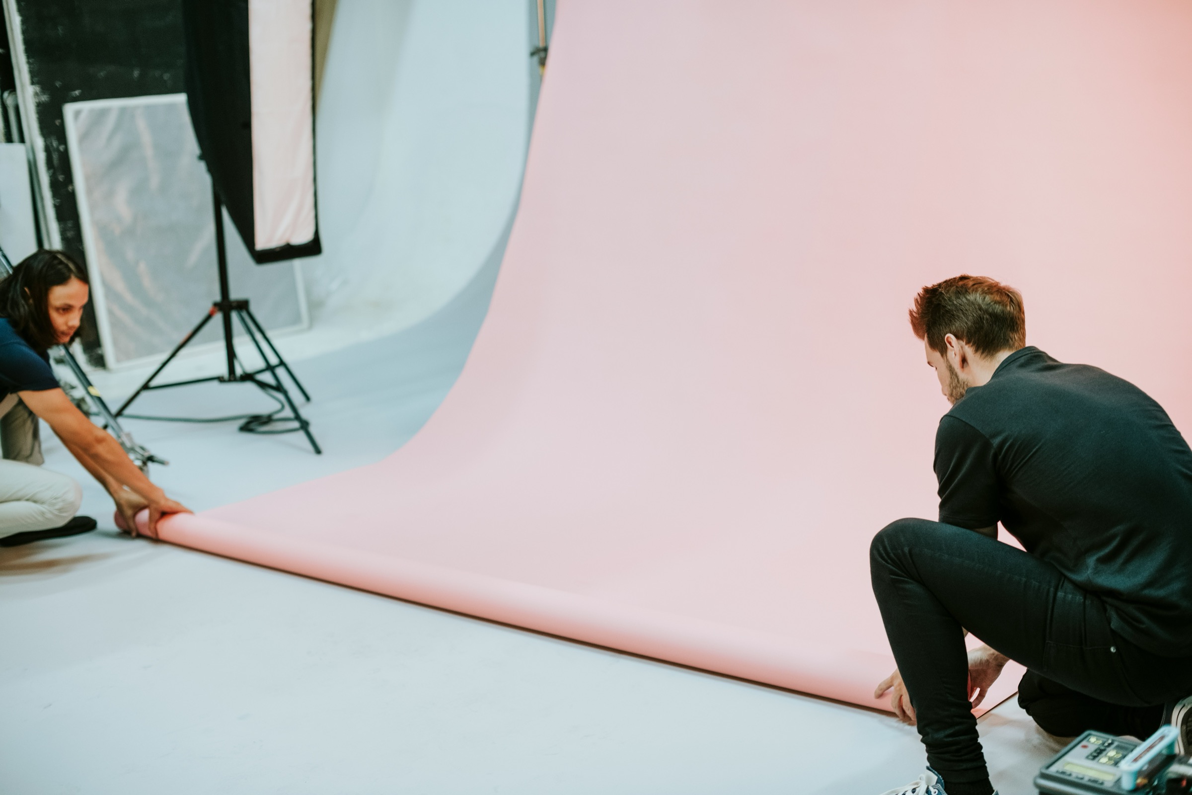 06
06
The paper, the crew and the hour before anyone arrives.
View project
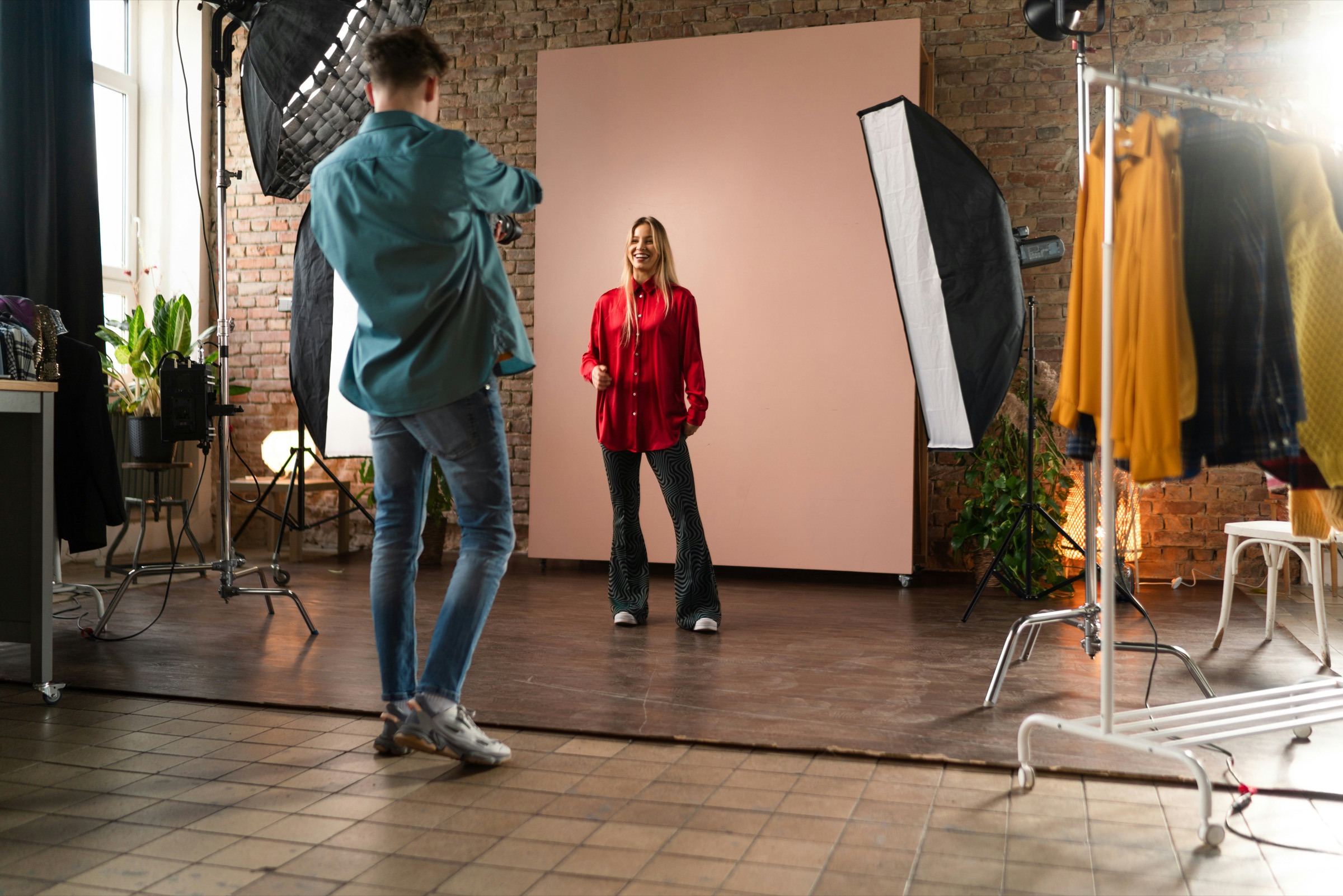
A morning of sittings, all of it on one light.
Focus pulled to the back of the camera.
The last slot of the morning.
Six people booked in half-hour slots, one light left where it was set at eight in the morning, and no retouching beyond dust. The point was to see what a studio looks like when nothing is moved between sitters.
The frames that came out best were the ones shot while the sitter was still settling.
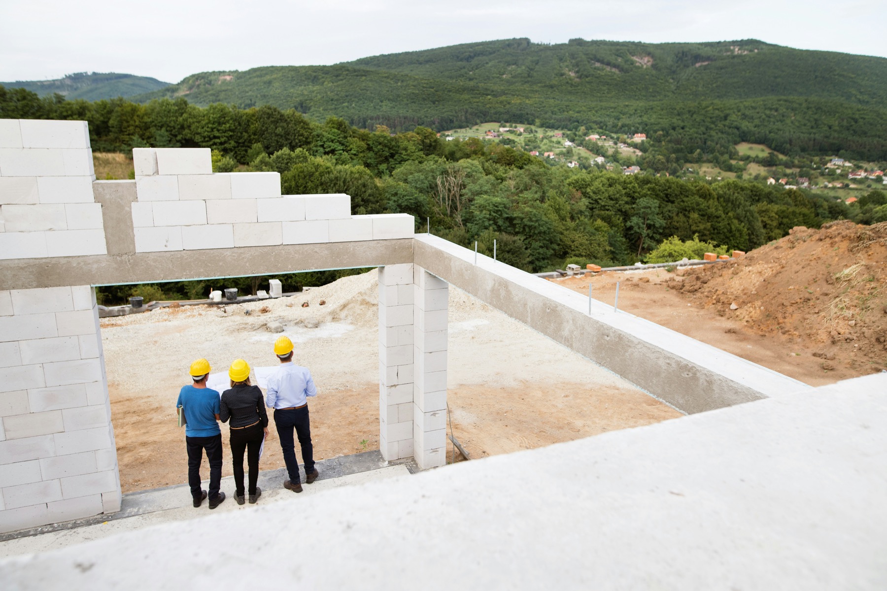
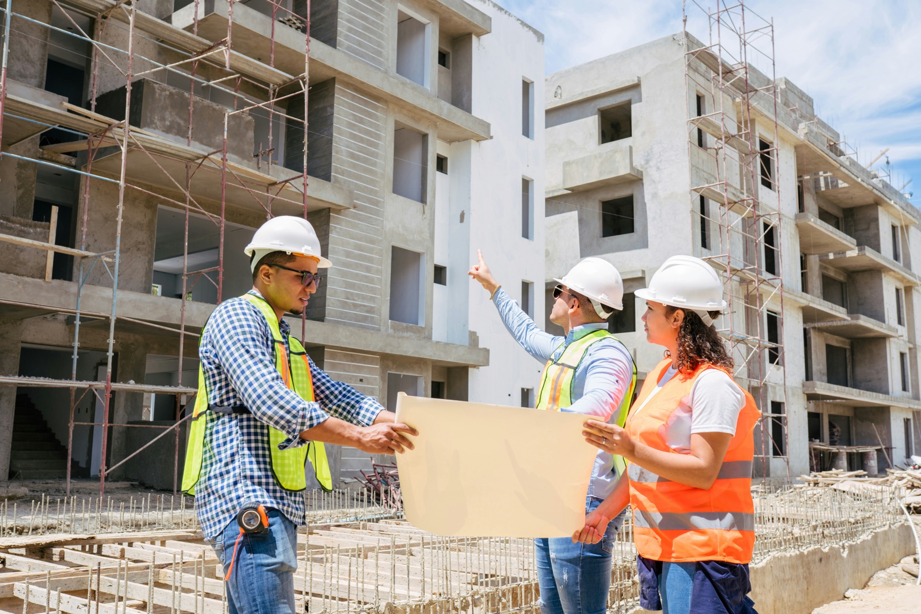
A lookbook shot against a wall we built in a field.
The indoor half, shot the day after.
A colour test from the morning.
The wall was four sheets of ply, painted on the Friday and carried up the hill on the Saturday. Everything was shot between eleven and one, when the sun was hard enough to throw the shadow the client wanted.
Four mornings on the headland, cut to ninety seconds.
A frame from the second morning.
The studio cut, with sound.
The client wanted something that could sit on a homepage with the sound off and still say where they work. We shot at first light on four consecutive mornings and cut it to a length nobody has to commit to.
The same footage runs behind the tile here, muted and looping, and pauses the moment it leaves the screen.
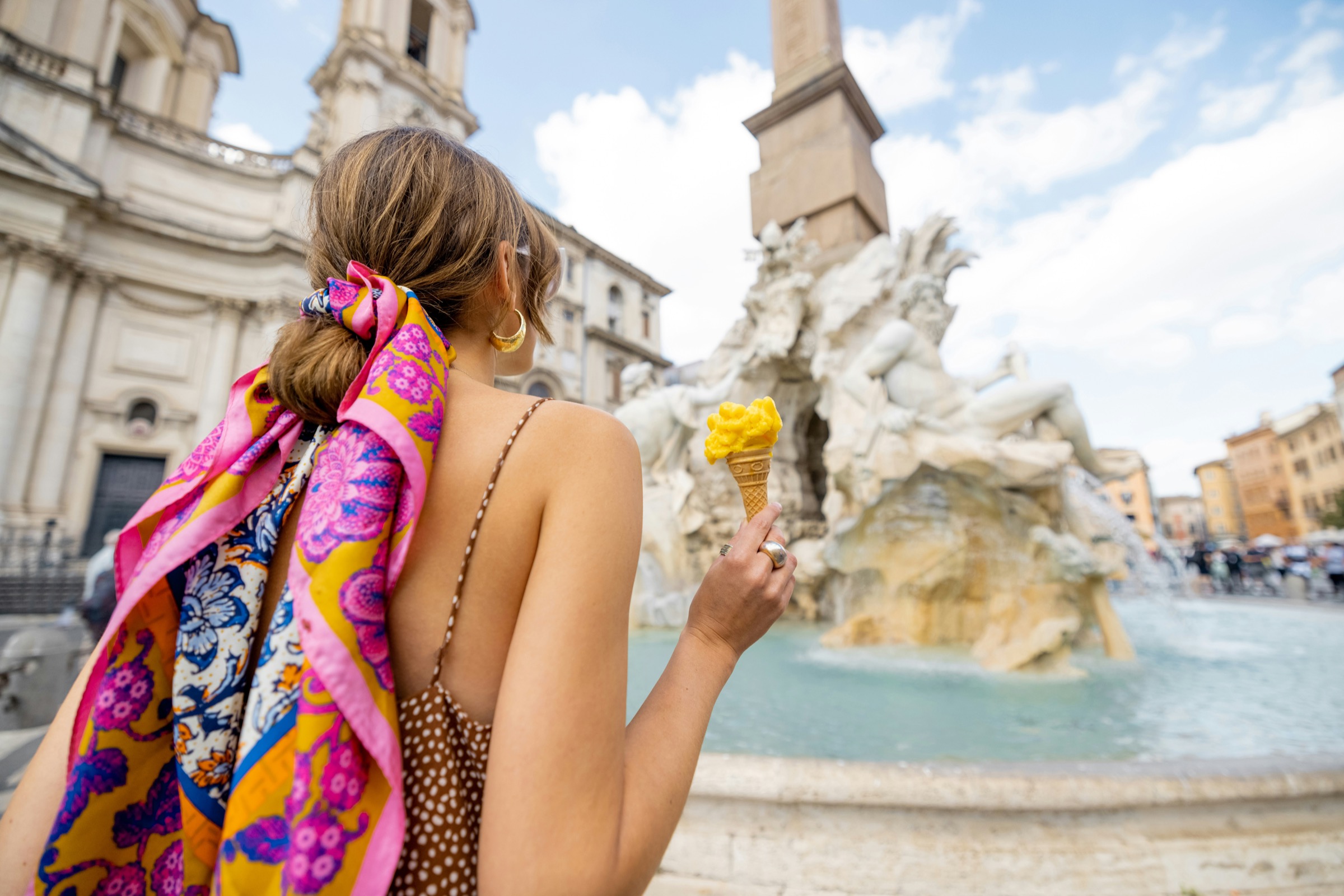
A wedding walked out to the top of the hill for the last hour of light.
The walk back down.
The couple asked for no set-ups and no group shots after the meal. We walked out at half past eight, stayed twenty minutes, and came back down.

A city guide shot on foot in a single day.
The second city, a week later.
Late morning, before the square filled.
One camera, one lens, and a route worked out the night before. The brief was to show the walking rather than the landmarks, so most of the frames are backs and shadows.
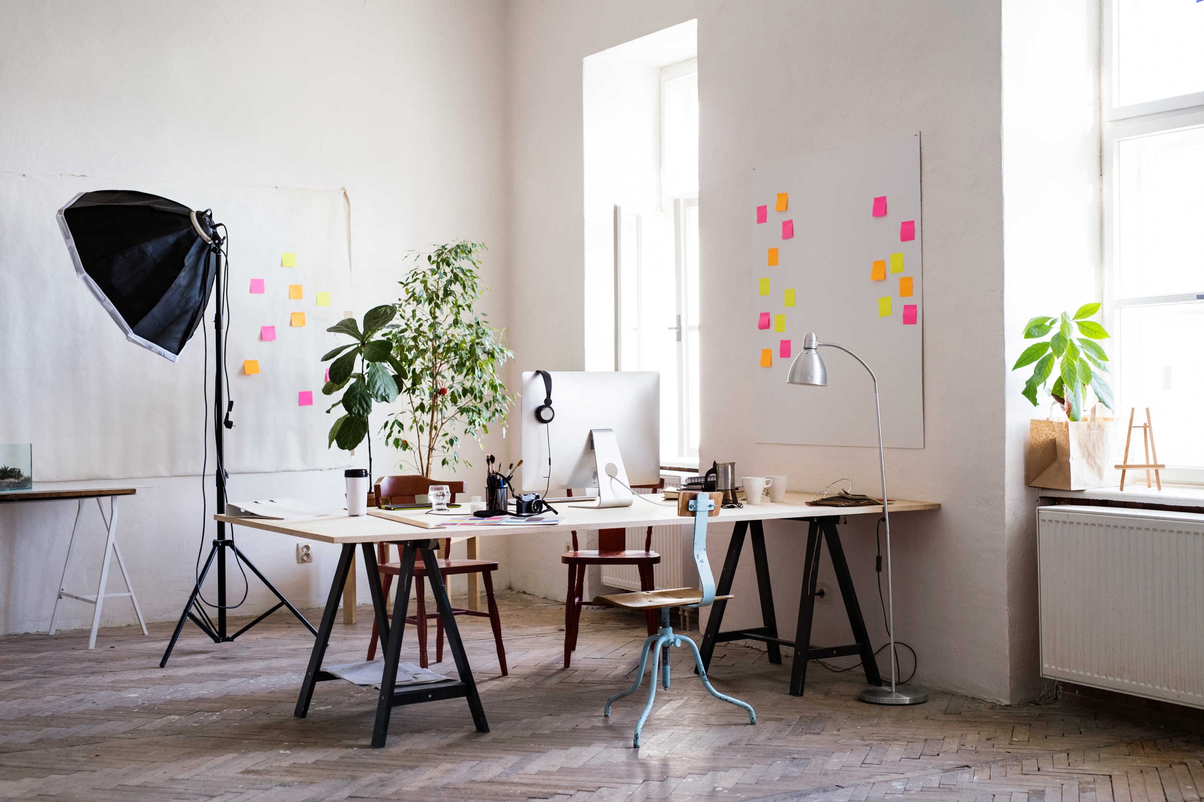
The paper, the crew and the hour before anyone arrives.
The desk it all gets edited on.
A record of the set-up rather than the shoot. It runs on the studio's own page and books more work than the portfolio does.
Demo 2
Tiles of different sizes tessellating. The arrangement is worked out on the server and written as a grid position for every tile, once for each breakpoint, so every row fills and the bottom edge is straight. Sizes come off the project itself, and a project left on Automatic takes the repeating pattern. There is no card chrome here and nothing written across the pictures at rest. Reach a tile with the pointer or the keyboard and a wash comes up the bottom edge with the project name and the line under it rising into it, each on its own mask, one following the other. Where there is no pointer the caption is simply there. A tile opens a lightbox with the same words set under the picture.
Open a picture to read what it was.
A lookbook shot against a wall we built in a field.
Open the project
A morning of sittings, all of it on one light.
Open the project
A working day followed from the car park to the last of the light.
Open the project
One prop, one wall, and the shadow doing the work.
Open the project
A city guide shot on foot in a single day.
Open the project
A shop photographed empty, before it opened for the day.
Open the project
The paper, the crew and the hour before anyone arrives.
Open the project
A portrait that took one roll and no direction.
Open the project
Shot before the square filled, which is the only hour it is worth shooting.
Open the project
A wedding walked out to the top of the hill for the last hour of light.
Open the project
A suit photographed lying down, because standing up said nothing.
Open the project
The same sitter, a year on, on the same paper.
Open the project
A lookbook shot against a wall we built in a field.
The indoor half, shot the day after.
A colour test from the morning.
The wall was four sheets of ply, painted on the Friday and carried up the hill on the Saturday. Everything was shot between eleven and one, when the sun was hard enough to throw the shadow the client wanted.
A morning of sittings, all of it on one light.
Focus pulled to the back of the camera.
The last slot of the morning.
Six people booked in half-hour slots, one light left where it was set at eight in the morning, and no retouching beyond dust. The point was to see what a studio looks like when nothing is moved between sitters.
The frames that came out best were the ones shot while the sitter was still settling.
A working day followed from the car park to the last of the light.
No brief and no client. Shot for the studio, used everywhere since.
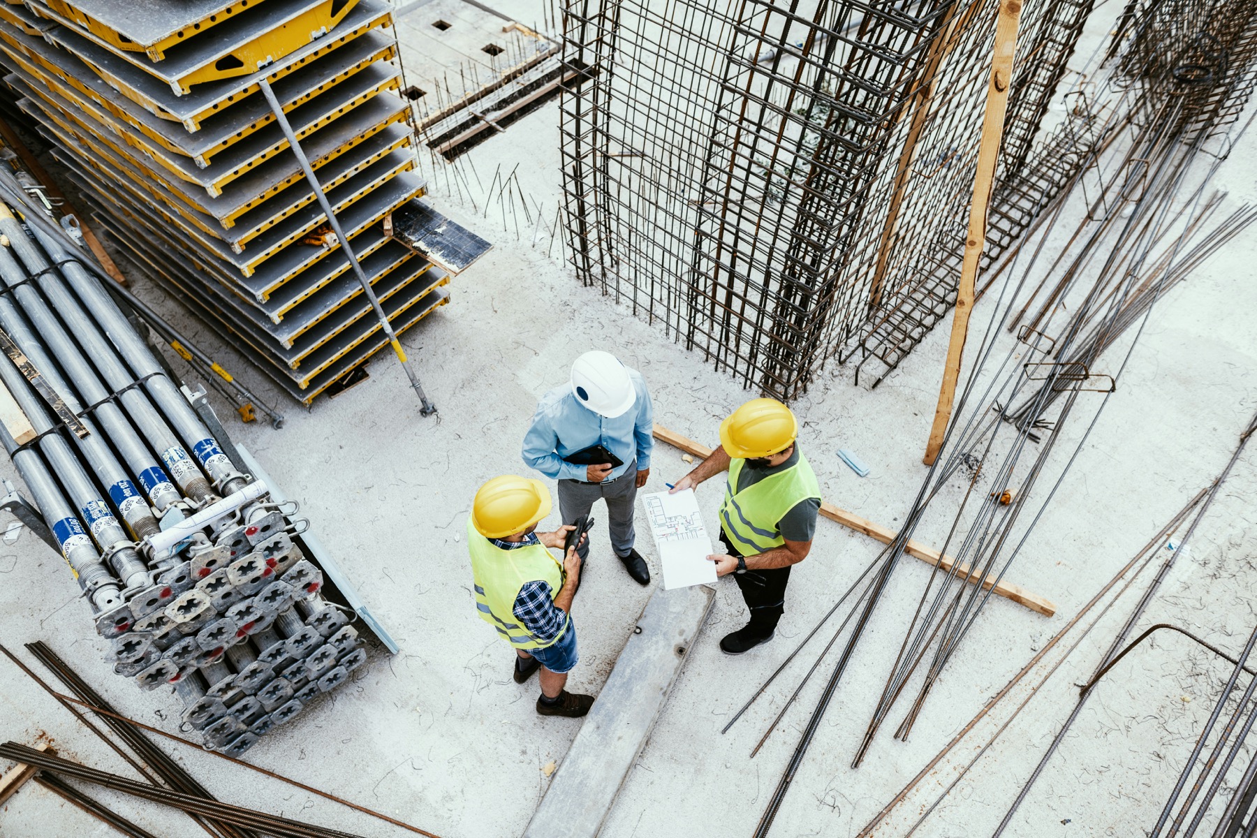
One prop, one wall, and the shadow doing the work.
The wall opposite, an hour later.
The whole shoot happened in the two hours the light crosses that wall. Nothing was added after.
A city guide shot on foot in a single day.
The second city, a week later.
Late morning, before the square filled.
One camera, one lens, and a route worked out the night before. The brief was to show the walking rather than the landmarks, so most of the frames are backs and shadows.
A shop photographed empty, before it opened for the day.
The look book was laid out here.
Shot between six and eight so the floor was clear. The rails were left exactly as the staff had set them the night before.
The paper, the crew and the hour before anyone arrives.
The desk it all gets edited on.
A record of the set-up rather than the shoot. It runs on the studio's own page and books more work than the portfolio does.
A portrait that took one roll and no direction.
The same sitter, in the studio, a month before.
She stood where she wanted to stand. We moved the light once.
Shot before the square filled, which is the only hour it is worth shooting.
Up at five, in position by six, finished by eight. The rest of the day was spent editing in a cafe.
A wedding walked out to the top of the hill for the last hour of light.
The walk back down.
The couple asked for no set-ups and no group shots after the meal. We walked out at half past eight, stayed twenty minutes, and came back down.
A suit photographed lying down, because standing up said nothing.
The outdoor half of the same season.
The first hour was spent standing the model against a wall and getting nothing. The sofa was in the corner of the room and solved it.
The same sitter, a year on, on the same paper.
Same lens, same distance, same roll of paper. The only thing that changed was the shirt.
Demo 3
Same module, different field values. The width is set to edge to edge, so the media runs to both sides of the window. The words do not: they sit on their own inset inside that frame, on a measure you set, so a long summary stops before the far side. One wide tile per row, meeting the one above it — the space between stacked tiles is zero unless you ask for it — with the caption over the media on a scrim and video looping behind. The section heading is switched off here, and a stack sits flush against whatever is above and below it, so there is no band of section colour framing the first tile or the last. The modal opens dark to match.
Four mornings on the headland, cut to ninety seconds.
Open
A lookbook shot against a wall we built in a field.
Open
A wedding walked out to the top of the hill for the last hour of light.
Open
Four mornings on the headland, cut to ninety seconds.
A frame from the second morning.
The studio cut, with sound.
The client wanted something that could sit on a homepage with the sound off and still say where they work. We shot at first light on four consecutive mornings and cut it to a length nobody has to commit to.
The same footage runs behind the tile here, muted and looping, and pauses the moment it leaves the screen.
A lookbook shot against a wall we built in a field.
The indoor half, shot the day after.
A colour test from the morning.
The wall was four sheets of ply, painted on the Friday and carried up the hill on the Saturday. Everything was shot between eleven and one, when the sun was hard enough to throw the shadow the client wanted.
A wedding walked out to the top of the hill for the last hour of light.
The walk back down.
The couple asked for no set-ups and no group shots after the meal. We walked out at half past eight, stayed twenty minutes, and came back down.
Demo 4
Four square tiles to a row with the words over the media. At rest the title sits low against the bottom of the tile with nothing under it. Reach the tile and the summary opens the row it lives in, which carries the title up as the summary rises into the space it has just made — one movement, both of them travelling. The filter row is centred and the drawer comes in from the left.
A wall found on the way to somewhere else.
Open
The same sitter, a year on, on the same paper.
Open
A portrait that took one roll and no direction.
Open
One prop, one wall, and the shadow doing the work.
Open
A suit photographed lying down, because standing up said nothing.
Open
Nothing on the roll yet and it is already the best frame of the day.
Open
A shop photographed empty, before it opened for the day.
Open
What the back of the camera sees while the room waits.
OpenNothing filed under that yet.
A wall found on the way to somewhere else.
We were walking back to the car. The light was crossing the tiles and we shot for eleven minutes.
The same sitter, a year on, on the same paper.
Same lens, same distance, same roll of paper. The only thing that changed was the shirt.
A portrait that took one roll and no direction.
The same sitter, in the studio, a month before.
She stood where she wanted to stand. We moved the light once.
One prop, one wall, and the shadow doing the work.
The wall opposite, an hour later.
The whole shoot happened in the two hours the light crosses that wall. Nothing was added after.
A suit photographed lying down, because standing up said nothing.
The outdoor half of the same season.
The first hour was spent standing the model against a wall and getting nothing. The sofa was in the corner of the room and solved it.
Nothing on the roll yet and it is already the best frame of the day.
Kept because the client asked what a shoot actually looks like.
A shop photographed empty, before it opened for the day.
The look book was laid out here.
Shot between six and eight so the floor was clear. The rails were left exactly as the staff had set them the night before.
What the back of the camera sees while the room waits.
A frame from between the frames. It ended up as the cover of the studio's own book.
A portfolio section for HubSpot CMS. Each project is a tile carrying an image or a video. Open a tile and the project arrives in a centred modal, a drawer that slides in from the side, or a lightbox, with its own media strip, write-up, details block, tags and a link out. You move between projects without closing anything.
Grid. Even columns, a column count you set for desktop and another for tablet, and a single column on a phone.
Carousel. One row that scrolls sideways and snaps card to card, running past the container on both sides so part of the card before and part of the card after show either side of it. You set how many cards sit across on a desktop, on a tablet and on a phone, and the least of the neighbouring card that has to stay visible; the card width is worked out from those, so the same settings hold at any container width. Where the section has room over the container's measure the strip either side is that room and the cards sit exactly on the container's line; where it has none the strip is held open and the heading is set to the same line, so the words and the pictures stay aligned at every width. Keeping the row inside the container instead is a field.
By default the row has no end: the card before the first and the card after the last are there, so there is work either side from the moment the page loads and the arrows never run out. Give it two ends on a field and they disable themselves at each. The track is a plain scroller, so a finger drags it and a trackpad throws it without anything being intercepted, and the wheel is left doing what the page expects — the page scrolls past a carousel, it does not get caught in one. A mouse can drag it too, and a drag never opens the card it finished on. Arrows and the arrow keys move it a card at a time, with a duration and an easing of your own. A bar, a count, both or neither sit under it, on the side you choose.
Mosaic. Tiles of different sizes — standard, wide, tall and large — tessellating into complete rows. Each project carries its own size, and one left on Automatic takes the repeating pattern you pick. The arrangement is worked out when the page renders and written as a grid position for every tile, once for the desktop column count, once for the tablet one and once for the phone, so no row is ever left part empty and the bottom edge is straight at every width. The grid carries no words and no borders. A tile opens a lightbox, which is where the title and the caption live.
Full-bleed stack. One wide tile per row with a height set in screen heights. Put the words over the media and it fills the viewport. Edge to edge applies to the media. The words keep a side inset, a top and bottom inset and a text width of their own, each a field, with phone values alongside. The space between stacked tiles is zero, so one full-width tile meets the next; it is a field on the Grid group if you want them apart.
The section runs to a maximum width you set, or edge to edge, on a field in the Container group.
A tile takes an image, or a video with a poster. A video tile plays muted on a loop behind the words and pauses itself whenever it scrolls off the screen, so a page of them costs nothing while it is not being watched. The poster carries the tile until the file is ready, and stands in for the video entirely for a reader who has asked for less motion. You can also hold a video tile on its poster and give the moving version only to the opened project.
Chosen on a field:
All three trap the keyboard inside the panel, close on Escape or on the backdrop, and hand focus back to the tile that opened them. The page behind cannot scroll while a project is open. Previous and next move between projects in place, with a counter whose separator is a field.
A media strip that starts with the tile's own media and continues with anything else you add, images and video together, each with its own caption and a thumbnail rail. A rich-text write-up. A details block built from a repeater, so the labels are your words rather than ours. Tags. And a link out.
Switch the filter row on and list the pills you want. Each pill carries the text a reader sees and the category it matches, so a pill can read one way and match another. The row fades the grid out and back rather than snapping, and there is an empty state you write for a category with nothing in it.
Tiles in a row stretch to the same height, and the link sits on the bottom edge, which puts it at the same height right across a row. That holds in the carousel too, where every card in the track is as tall as the tallest. Both clamps are off to begin with, so a summary runs as long as it is written. Hold the summary to a set number of lines and the title to another, both fields, and a long description cannot push one tile taller than the rest.
A grid, two tiles to a row, no tile border, no tile background and no panel behind the words. The picture carries the tile and the words sit under it, flush with its edge, held off it by a gap of their own. The project title is bold, tightly led and measured against the width of the tile, so it holds its proportion whatever the column count. The eyebrow above it is small, uppercase and widely spaced.
All of it is a field. Give the tile a background, raise the border width, the corner radius and the words padding, lower the title size and raise the column count, and the boxed card grid is back.
The project title grows against the width of the tile rather than the width of the window, so a big title stays in proportion whatever column count you pick. Switch it back to the window on a field if you would rather it tracked the viewport. Smallest size, largest size and growth rate are all fields, and the phone size is separate.
Scroll reveal with a travel, a duration, a starting scale and a stagger between tiles. Hover treatments: the media zooms, the tile lifts, the words rise in, or a colour washes over. Modal and drawer have their own durations, easings, travel and starting scale. The carousel has a duration and an easing for the travel between cards and another for the settle after a drag. Media crossfades and project swaps have theirs. Every one of those is a field, and every field is a plain number of milliseconds or pixels.
Nothing here animates a property that forces the browser to redo layout. Movement is transform and opacity, which the browser can hand to the compositor.
A reader whose system asks for less motion gets the section with transitions and animations switched off, tiles already in place, hover treatments held still, video tiles replaced by their poster frames, the modal and drawer appearing without travel, and the carousel putting the next card where it belongs in one step instead of running it there. The track still snaps. That follows the reader's own setting, so an editor cannot switch it off by accident.
Every tile is a button with the call to action and the project title read out to a screen reader. Focus rings are visible and their colour, width and offset are fields. The opened panel is a dialog, keeps the keyboard inside it, closes on Escape and returns focus to the tile it came from. Filter pills carry their pressed state. Thumbnails carry theirs. Images take their own alt text, background video is marked decorative and kept out of the tab order, and every screen-reader string is a field you can translate.
The carousel track is a labelled region that can be tabbed to. The arrow keys move it whether the track or a card inside it has focus, Home and End go to the ends, and a card reached by keyboard is brought into the track rather than left behind its edge. The two arrows are real buttons that are properly disabled at the first and the last card rather than left live with nothing to do.
Every colour, size, weight, letter spacing, radius, space, duration and easing is a field on the Style and Motion tabs, grouped by what it affects: typography, key colours, section, container, section heading, filter row, grid, carousel, mosaic, tile, tile words, modal, drawer, lightbox, close button, opened project words, media strip, and previous and next. Colour fields carry opacity as well as a colour and both are used. Body font, heading font and both key colours inherit from your HubSpot theme settings. No colour, font or string is hard-coded, and nor is any size a buyer would want to set. Five relative values are fixed on purpose: the arrow beside the tile call to action is sized at 1.15em and nudged 0.3em on hover, both against the call to action's own size; paragraphs in the write-up are spaced 1em apart, against the body size; and the screen-reader-only text is clipped to a single pixel, which is what takes it off the screen.
transform, a filter or contain becomes the containing block for anything fixed. Move the module out of that wrapper.case study will not match casestudy.Four instances of one module, differing only in field values: a carousel of portrait cards opening into a drawer, a mosaic opening into a lightbox, a dark full-bleed stack with the type taken up, and a tight square grid whose words wait for the pointer. No CSS on this page touches the module.