A real Apple iOS 26-style liquid glass button. A squircle-bezel lens magnifies and bends the background only at the rim — so the clear centre stays sharp and readable — with a prismatic chromatic edge, glossy specular sheen, 3D bevel and a hover sweep. Works in every modern browser. Every value is editor-controlled — shape, padding, font, icon, tint, refraction, chromatic, shadow and hover. No CSS edits.
The default Apple look: fully rounded pill, label + arrow on the right. Near-zero blur so the photo stays sharp, then the liquid lens magnifies and bends it at the rim with a prismatic chromatic fringe and a glossy wet sheen.
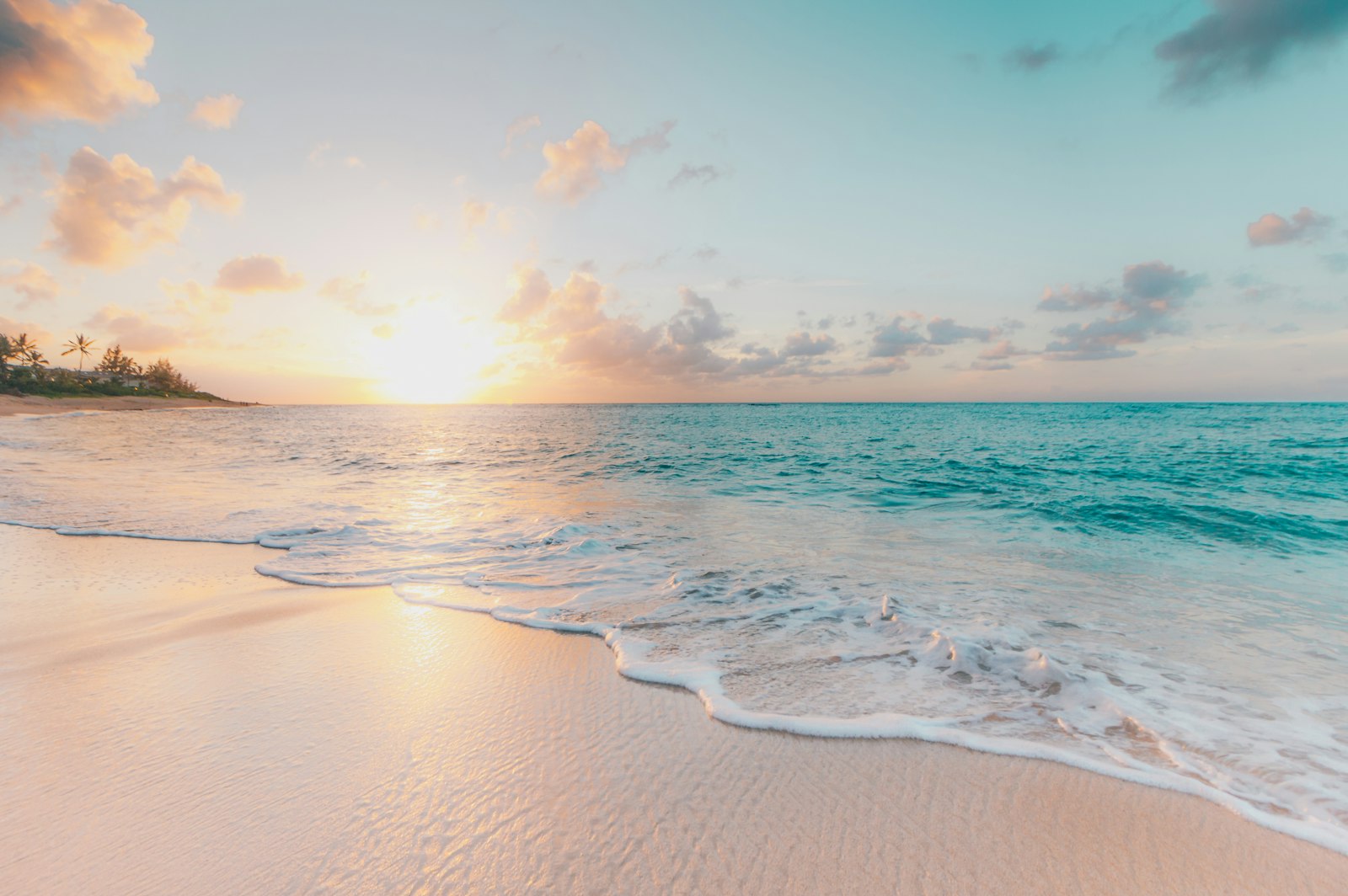
Same pill, no icon, wider padding. Stronger refraction (55) so the busy mountain ridge visibly magnifies and bends through the clear glass at the rim.
16px radius with a cart icon on the left and an UPPERCASE tracked label (App Store style). Saturation cranked to 250% so the neon bleeds through the glass.
shape: square gives 0px corners on a magenta→indigo gradient, with a search icon. The sheen runs at 200° (top-right) for a different reflection direction.
Set icon position: only with shape: circle for a round icon button — perfect for play, scroll, or floating actions. Larger 28px play glyph fills the form.
Push tint opacity to 35% with a brand colour (#DA2916) for coloured, stained-glass over a dark stone wall. Calendar icon, warm cream label.
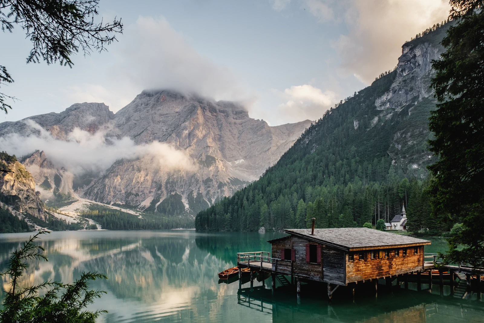
Specular at 75%, inner ring at 85%, a dark label and a bright tint make a chrome-mirror feel over an alpine lake. Light, floating drop shadow.
The arrow sits in a cream circle badge to the right of the label, the way Apple does opt-in CTAs. On hover the badge nudges right and tilts — a swipe affordance.
Liquid Glass CTA Pro recreates Apple's iOS 26 "Liquid Glass" as a single, fully editor-driven HubSpot button. Every value below is set from the module's Content and Style tabs — you never touch CSS. This page documents how it works, every field, browser behaviour, accessibility and performance.
The button renders as a stack of layers inside one <a> tag. Each layer maps to fields, so changing a setting just re-renders that layer.
feDisplacementMap driven by a squircle-bezel displacement map bends a copy of the background image. The map is flat in the centre (so your label and the view through the glass stay perfectly sharp and readable) and curves only in the outer rim band — exactly how light bends at the thick edge of a real piece of glass.backdrop-filter: blur() saturate() brightness() cleans up the view through the glass and is the graceful fallback when there is no background image to refract.mix-blend-mode: screen.box-shadow with all five values exposed, to float the button off the page.Why a copy of the background? Browsers deliberately block SVG displacement filters inside backdrop-filter on live https pages (a pixel-security restriction — it only works in local previews). So instead of filtering the live page behind the button, the module paints an aligned copy of your background image inside the button and refracts that with a normal filter. A tiny built-in script keeps the copy registered to the real background and re-aligns on resize and scroll. The upshot: the refraction renders correctly in every modern browser (Chrome, Safari, Firefox, Edge), not just Chromium.
The lens needs to know what's behind the button. Provide that in one of two ways:
If no background image is supplied (a button dropped over plain page content), the lens turns off automatically and the button falls back to a clean frosted-glass look — still glossy, with the sheen, bevel, border and shadow intact.
Shape (pill / rounded rectangle / square / circle), corner radius (rounded only), alignment (left / center / right), full-width toggle, horizontal & vertical padding, label font (family, size, weight, colour), label case, letter-spacing, icon size, icon colour, icon-to-label gap, and the circle-badge size, background & icon colour.
Backdrop blur (keep 0–4 px for clear glass; raise for frosted), saturation %, brightness %, and tint colour + opacity.
Enable/disable the lens; refraction strength (how far the background magnifies & bends at the rim — 35–55 is the sweet spot); chromatic aberration (prismatic edge fringe — 0 none, 25–35 tasteful); edge softness (how smoothly the bend transitions); and the optional background image to refract.
Specular sheen intensity (0–100, glossiness), sheen colour, sheen angle, outer border colour + width, and inner chrome-ring colour + width.
Colour + opacity, X offset, Y offset, blur, and spread — the same controls as a standard CSS box-shadow.
Lift (px), scale (%), blur delta, hover tint, hover border colour, an optional diagonal sheen sweep with its own duration, and the overall transition duration.
Wrap the button in an image, gradient, or solid-colour band with adjustable vertical padding and minimum height — for marketing pages and heroes (and to give the lens something to refract).
aria-label; all decorative glass layers are aria-hidden.:focus-visible outline.prefers-reduced-motion.The clear-glass refraction works in all current evergreen browsers (Chrome, Safari, Firefox, Edge). The effect is GPU-composited and lightweight — the alignment script only runs on load, resize and scroll, and the displacement map is an inline data-URI (no extra network requests; Font Awesome loads once from CDN). On unsupported engines the button degrades to a frosted glass panel with the full sheen, bevel, border and shadow.