9 days to 1
Fintech
Cut onboarding from nine days to one
A rebuilt application flow, a shorter form, and a status page the applicant can actually read.
Scroll over it and the panels move sideways instead of the page. The section takes up only the room it needs, so it adds no empty height to scroll through. Panel width and sensitivity are fields. Progress runs as a bar, dots or a counter, arrows and the arrow keys step between panels, and phones get a swipe or a plain stack instead of a pin.
Half-width panels
The default shape. Two panels are visible at a time so the next one is always half-read, which is what pulls people through. The bar tracks the panels exactly, and the arrows drive the same position, so nothing can drift out of sync.
Case studies
Scroll over the panels and they move sideways instead of the page. When the last one arrives, the page carries on.
Fintech
Healthcare
Manufacturing
Education
Logistics
Full-viewport panels
Full-width panels turn the section into a slide deck driven by scroll. Progress reads as a counter instead of a bar, and the scroll hint sits under the controls. Nothing here is a dark-mode switch. Every colour is its own field.
Product tour
Step one
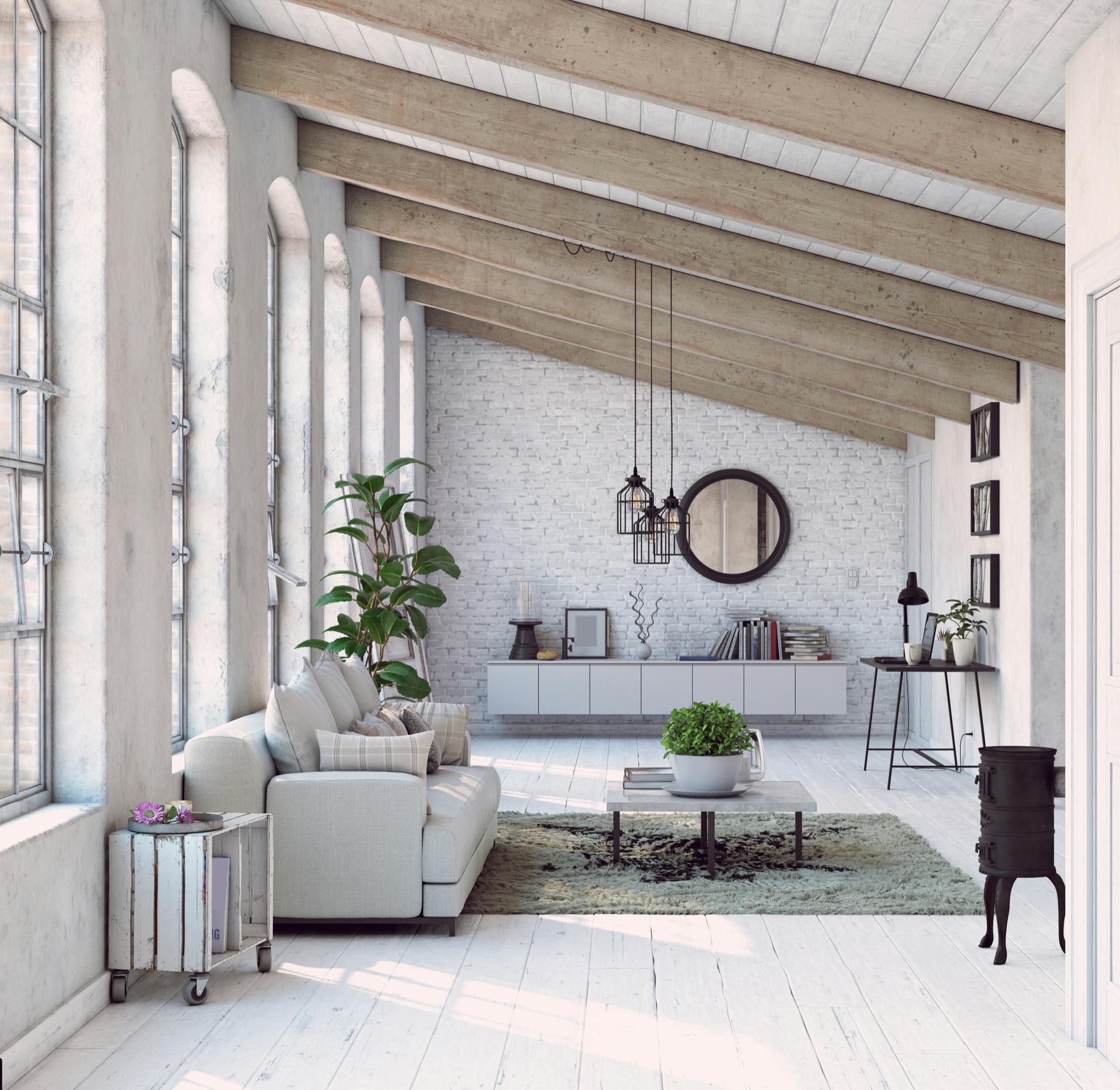
Step two
Decide how far the panels travel per notch of the wheel.
This body is rich text, so a wide card can hold a list.
Step three
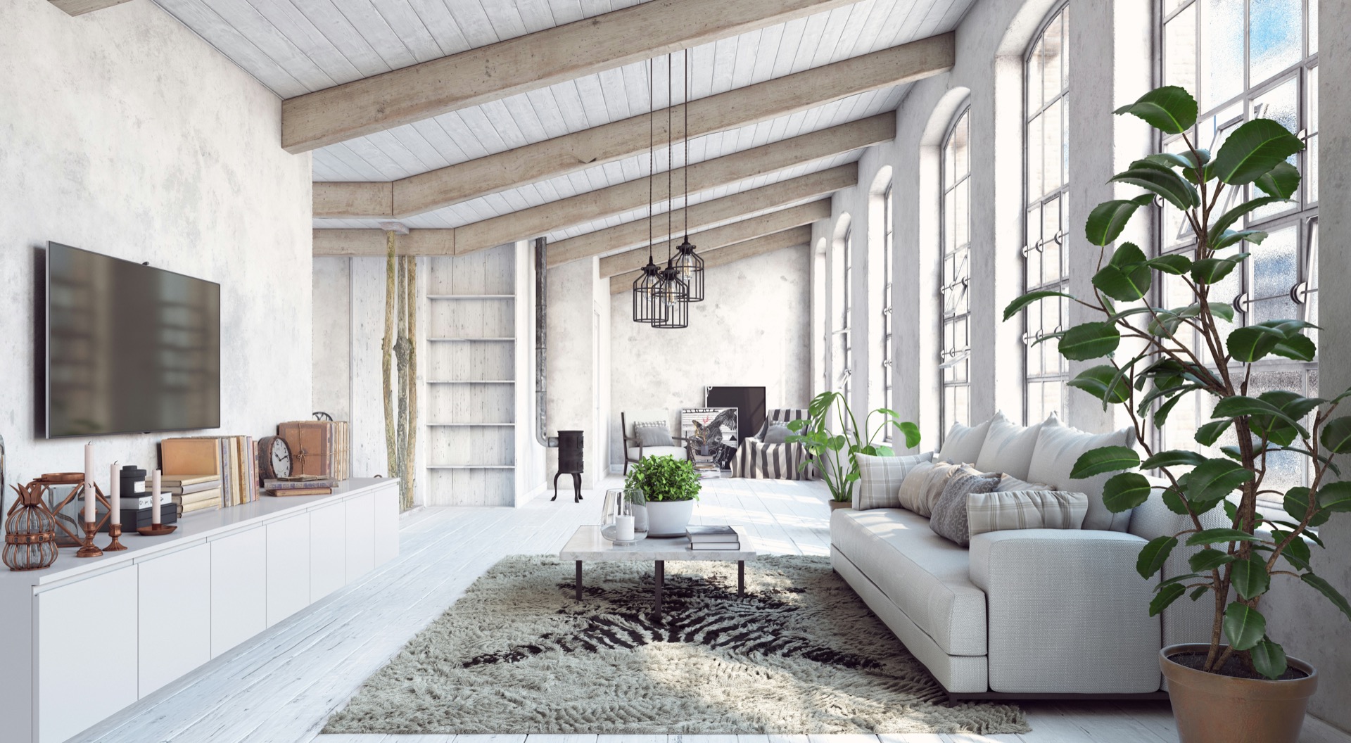
Step four
Scroll here to move sideways
Third-width panels
Narrow panels suit short items: a process, a set of principles, a timeline. The dots are buttons: clicking one scrolls the page to that panel, and the arrow keys do the same from the keyboard.
Fixed-width panels
Panels can be a fixed pixel width instead of a share of the screen, which keeps image crops identical on every viewport. The image shape, corner radius and fit are fields, and the panel content sits under the picture.
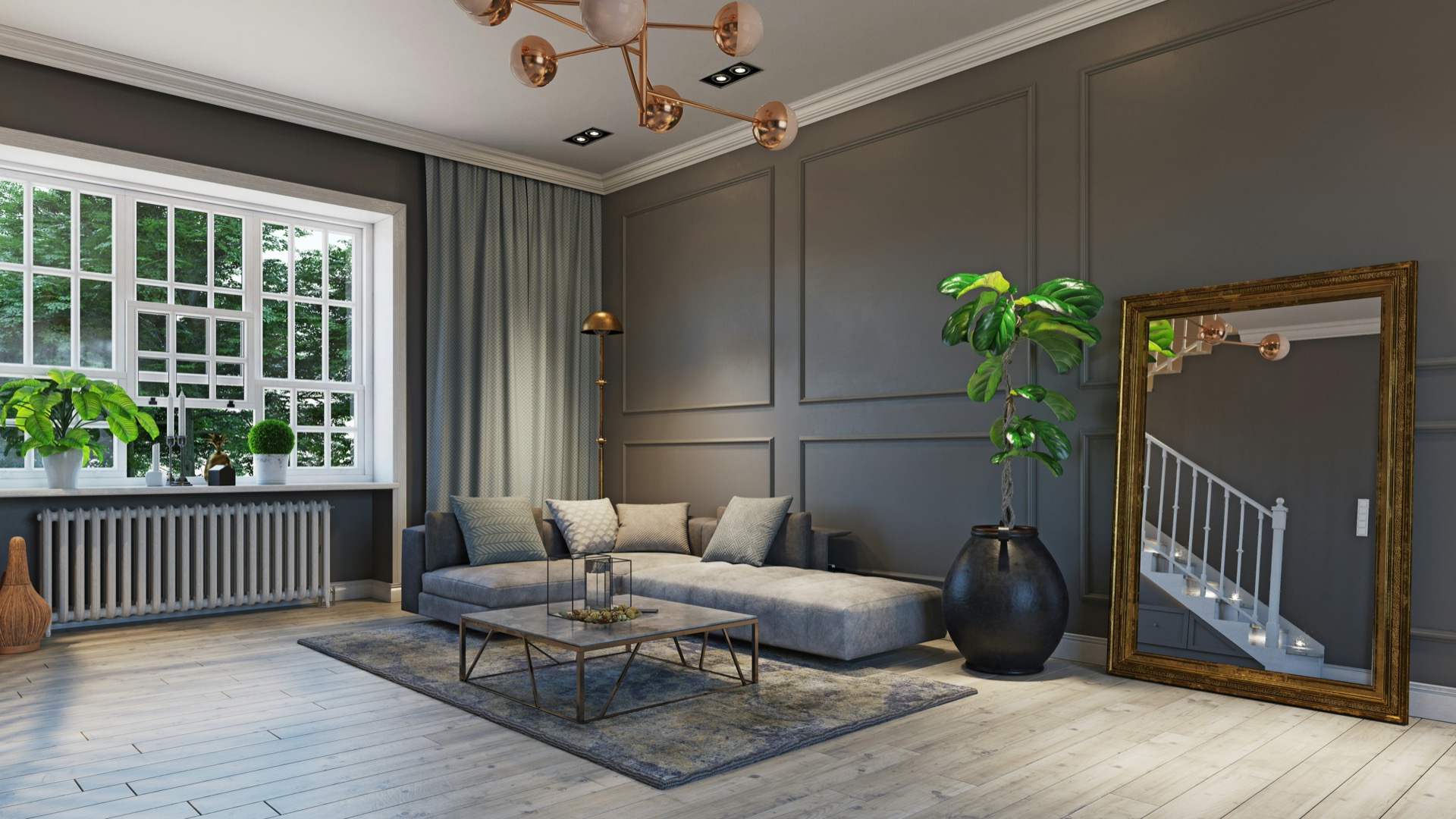
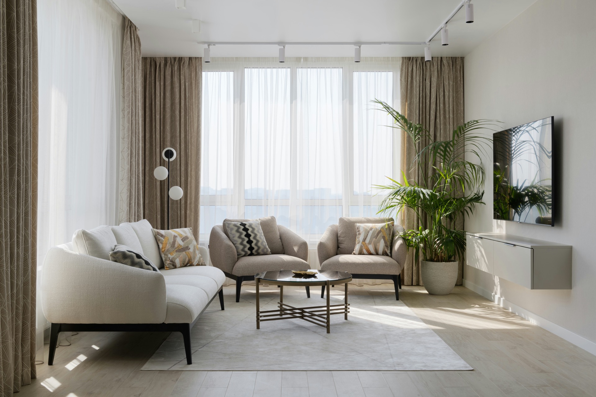
Living
Film
A card can hold a looping video instead of a photograph.
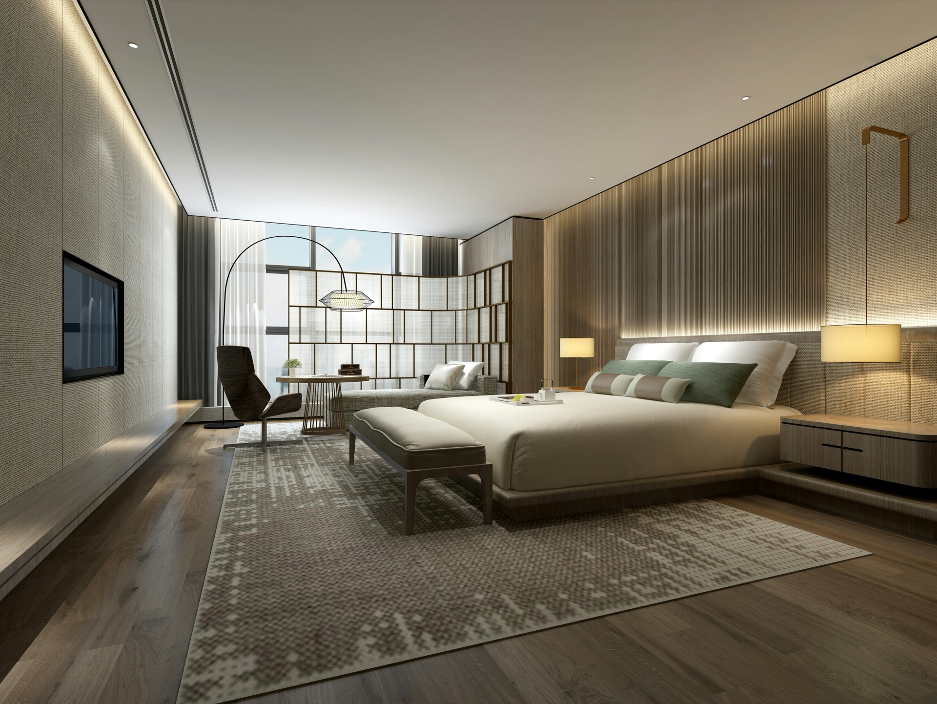
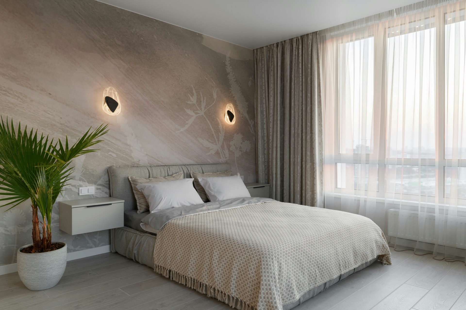
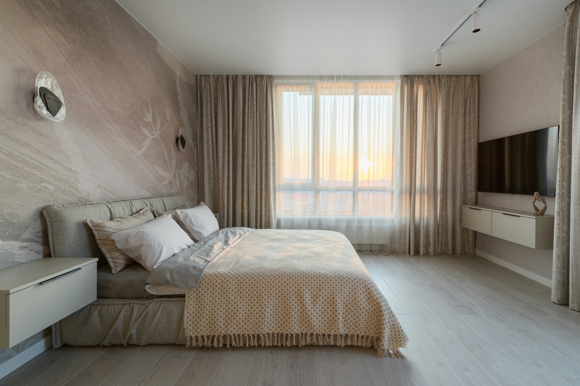
Bedroom
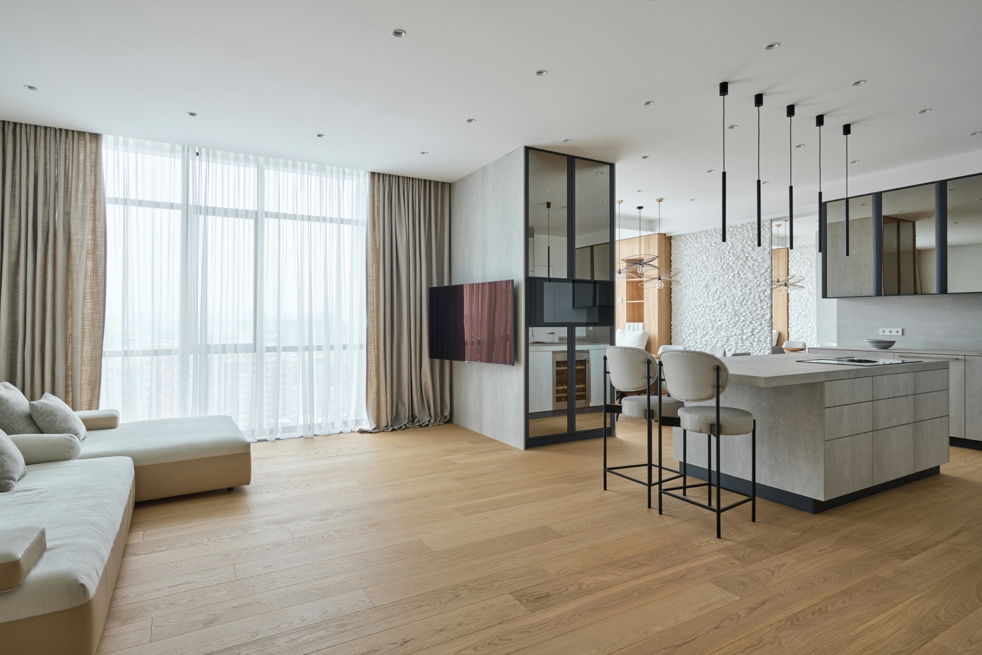
Study
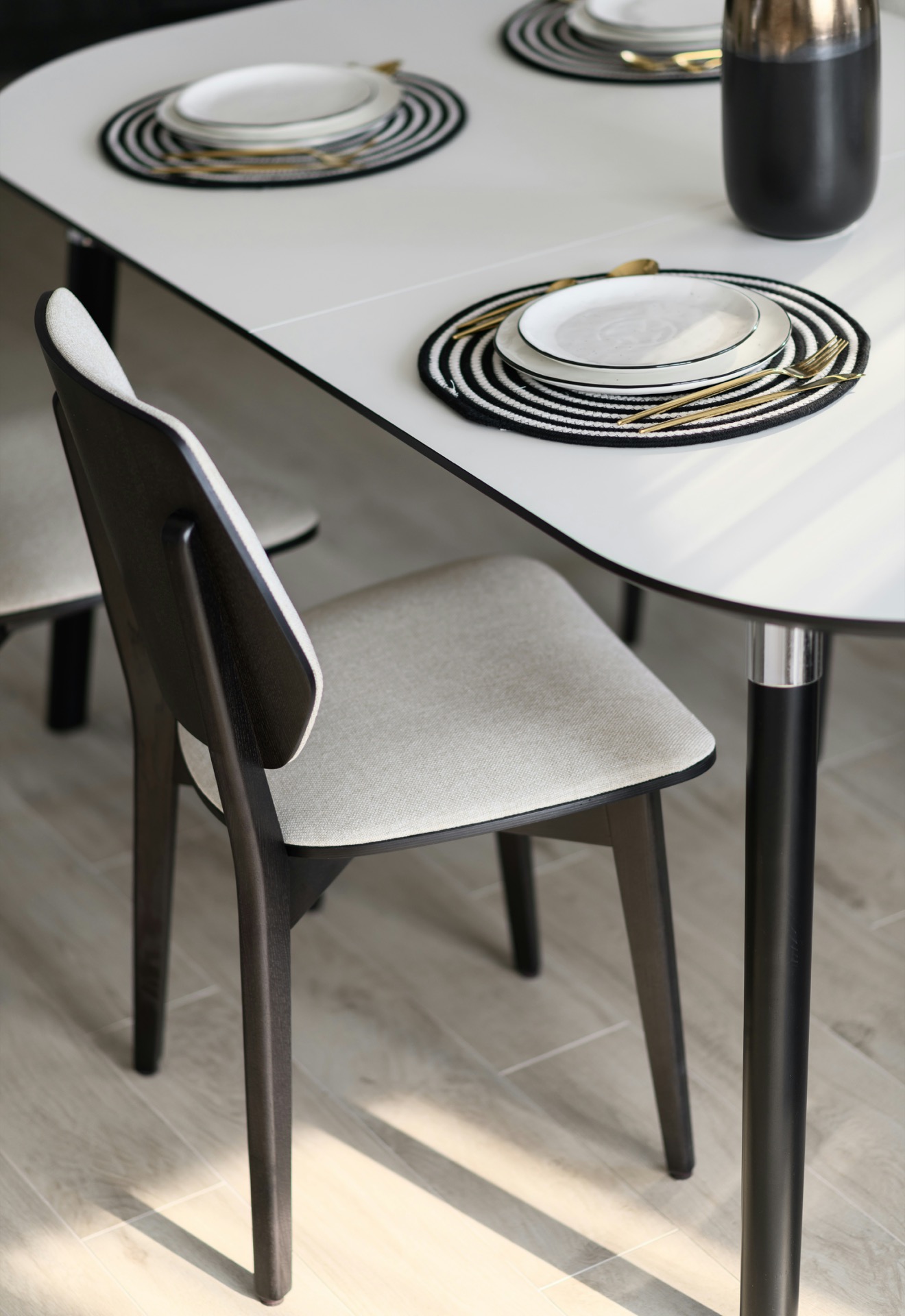
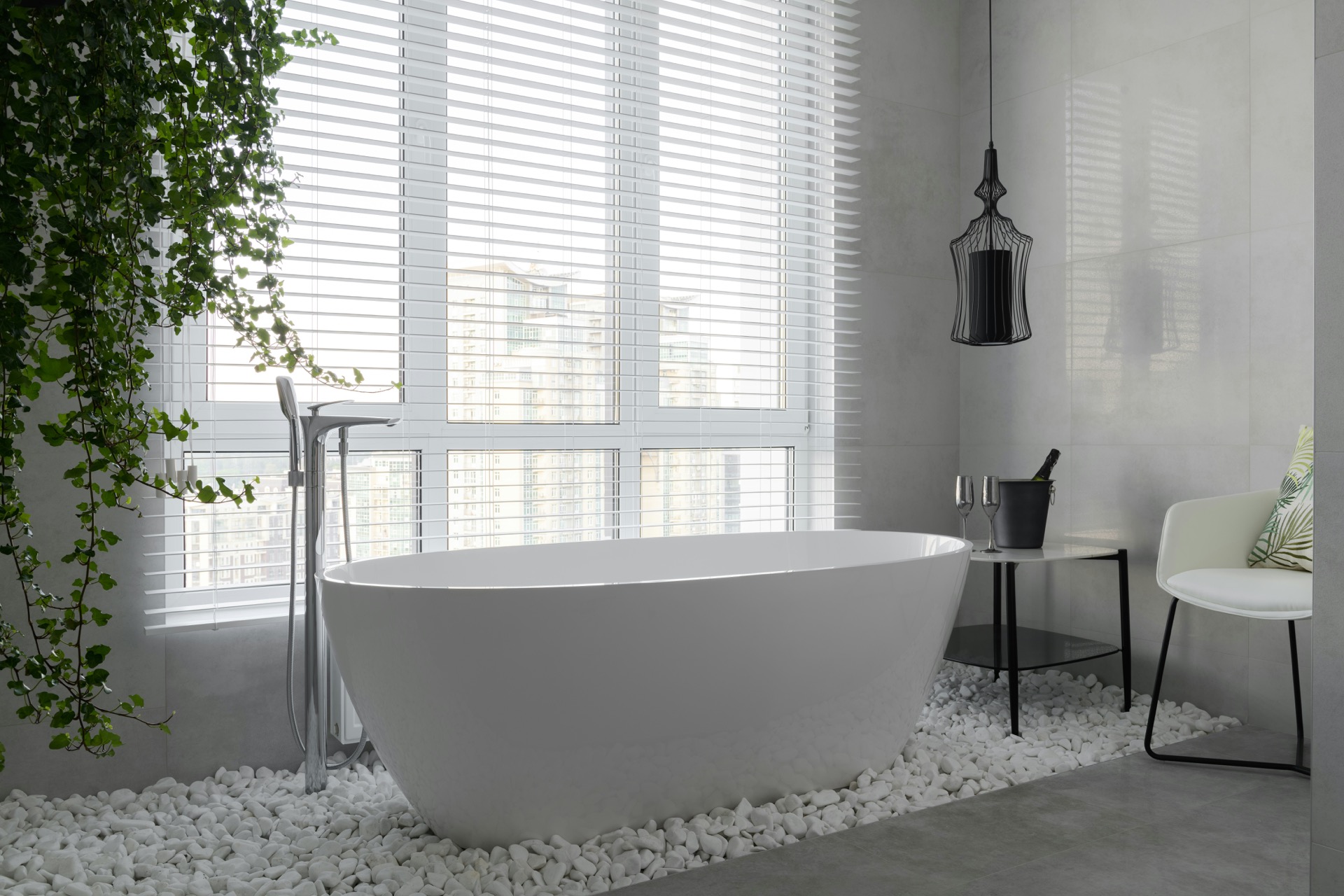
Kitchen
Add the module. Open a page in the editor, drag Horizontal Panels Pro in from the module list, and it renders straight away with four sample panels so you can see the movement before you write anything.
Write the panels. Open Panels and fill in the first card: an eyebrow, a title, body text, a badge, a picture or a video, and a link. Everything is optional except the title. Anything you leave empty is left out of the markup rather than rendered as a blank line, so a card with only a title and a picture looks deliberate. Add up to sixteen panels and drag them to reorder.
Choose a panel width. Under Motion & Behaviour, panel width decides the character of the section. Full viewport reads as a slide deck, one statement at a time. Half puts two on screen so the next is always half-read, which is what pulls people through. A third suits short items such as a process. A fixed pixel width keeps image crops identical on every screen, which is what you want for a picture wall.
Set the pace. Sensitivity decides how far the panels travel for one notch of the wheel. Leave it at 100% to start. Raise it if the panels feel sluggish, lower it if long copy leaves the screen before it can be read.
Check the height. The finished section has to be shorter than a laptop window or the wheel takeover never engages, and the panels will simply sit there. If that happens, reduce the panel height, the padding, or the heading size.
Style it. Everything on the Style tab is a field. Fonts and the accent colour inherit from your HubSpot theme until you override them, so a freshly-added module already looks like the rest of your site.
While the pointer is over the section, the wheel moves the panels sideways instead of moving the page. When the panels reach either end, the wheel is handed straight back and the page carries on from where it was. Nothing is queued or eased behind your back: the panels sit exactly where your last scroll left them, so a reader can stop half way through and the section stays put.
The section adds no height to the page. It is as tall as its heading, panels and controls, and not a pixel more. Modules that pin themselves usually insert a tall empty spacer for the sideways travel to be scrolled through, which stretches the page and leaves visible dead space; this one does not.
The wheel is only taken over when the whole section is on screen. If part of it is still below the fold, the page scrolls normally and brings it into view first, so a reader is never holding a hijacked wheel with the progress bar and arrows out of sight. A section taller than the browser window never takes the wheel at all and behaves like ordinary page content.
There is no animation library. The section moves the track with a CSS transform driven by the wheel, so there is nothing to collide with whatever the host theme already loads, and nothing extra to download.
Panels are a repeater, so an editor adds, removes and reorders them without touching a template. Each one carries:
Media is chosen per panel, so one card can be a photograph and the next a video:
Keep background video at around 1080p; a 4K file stalls in the browser and can fail to start at all. Video plays muted, which is what lets browsers start it without a click, and each one carries a poster image shown while it loads. Videos pause whenever their panel is off screen, so a page holding several of them costs nothing while they are not being watched.
A panel links in one of two ways. Fill in link text and it appears as a line under the body, underlined by default. Or switch on Make the whole panel clickable and the card itself becomes the link; an arrow appears in the corner instead of a line of text, and it shifts slightly on hover. Both can be used together if you want the words as well as the arrow.
The arrow is a field in every respect: shown or hidden, which corner it sits in, its size, the size of the icon inside it, its line weight, colour, background, border, corner radius, and its distance from the card edge. A clickable card exposes its title to screen readers as the link text and shows a focus ring when reached by keyboard.
Panel width sets how much of the screen one panel occupies: full viewport, wide at 80%, half, a third, or a fixed pixel width. Narrow panels put more on screen and read as a list; full-width panels read as a deck. Sensitivity sets how far the panels travel per notch of the wheel: below 100% they move slower than the wheel and linger, above it they move faster. The two interact, so change one at a time.
Let panels run past the edges decides whether the track is full-bleed. On, panels continue past the left and right of the page like a carousel and the first one lines up with your content column. Off, everything stays inside the content width.
Progress reads as a bar, a row of dots, or a counter such as 2 of 6, and the wording between the numbers is a field. The dots are buttons: clicking one moves to that panel. The arrows step to the next and previous panel and disable themselves at either end. The left and right arrow keys do the same thing when the section has focus. All of it can be switched off if the section is meant to be scrolled and nothing else.
Because the arrows and dots drive the same position the wheel does, the indicator can never fall out of step with what is on screen. At the very end of the track several panels share the same resting position — the track has run out of travel — so the indicator settles on the last one.
Panel height, the frame around the card, and the padding around the text are separate fields. That separation is deliberate: it lets a picture sit close to the card edge while the words keep a comfortable inset. Space above and below the panels adds breathing room inside the section, above the heading and below the controls.
Card shadows are drawn outside the card, and the track is clipped sideways to make the carousel work. The module measures the shadow from its own blur and drop settings and gives the track exactly that much vertical room, so a shadow is never sliced along the top or bottom edge.
The wheel is never taken over below a breakpoint you set, because a phone has no wheel and intercepting touch scrolling fights the browser. Below the breakpoint the panels either become a native swipe with scroll-snap, keeping the sideways shape, or stack under each other as ordinary cards. That is a choice per instance: a picture wall usually wants the swipe, a process usually wants the stack.
Anyone whose system asks for less motion gets the panels as a plain horizontal scroller with nothing intercepted, and background video held on its poster frame. That follows the reader's own setting rather than a setting on the page, so it is not something an editor can switch off by accident.
The section carries a label you write. The arrows carry descriptions you write, so a screen reader announces something better than "button". The dots expose which panel is current. Images take their own alt text, and background video is marked decorative and kept out of the tab order. Panels are articles with a real heading each, so the section reads as a list of things rather than a wall of text.
Every colour, size, weight, letter spacing, radius and space is a field, grouped on the Style tab by what it affects: typography, key colours, section, container, heading and eyebrow, panels, panel media, panel text, badge, panel link and arrow, and progress and arrows. Body and heading fonts and the accent colour inherit from your HubSpot theme settings and can be overridden per instance. Colour fields carry opacity as well as a colour, and both are used. There are no hard-coded colours, sizes, fonts or strings in the module.
Four instances of the same module, differing only in field values: half-width panels with a bar and clickable cards, full-viewport panels on a dark surface with background video and a counter, third-width panels with dots and clickable cards, and fixed-width panels holding a picture wall with one video card among the photographs. No CSS on this page touches the module.