A whole help center in one module on one page. A home page with search, categories of articles, articles with a table of contents, screenshots, videos and steps, search that answers as you type, and a way to reach a person when the answer is not there. Every article lives in the module's fields, and every colour, size and word is a field too.
The help center of Planyard, a made-up project planning app, with every page working. The home page has an announcement line, a search hero with popular searches, getting-started cards, the category grid, topic cards that run a search, popular and recently updated articles, a feature banner, video tutorials and a list of resources.
Open a category for its articles grouped into sections, with tag filters and page numbers. Open an article for breadcrumbs, a table of contents that follows the page, screenshots in a browser or phone frame, numbered steps, callouts, code, questions that open, videos, feedback and related articles. Type into the search box, or press / or Ctrl K anywhere on the page. Send a message opens a HubSpot form in a dialog.
Archive a project when the work is finished. It leaves the sidebar, but its tasks, comments, files and time entries stay. Reports still include its time. Nobody can log new time to an archived project.
Click the project name and choose Archive. Find archived projects under Projects › Archived.
Restore
Open the archived project and click Restore. It returns to the sidebar with every setting as it was.
Delete
Only Owners and Admins can delete projects. Deleted projects stay in Settings › Trash for 30 days, then are removed for good along with their time entries.
Warning
Deleting a project removes its time entries from reports and invoices. If you have billed the work, archive it instead.
Send us a messageA person from the support team reads every message.
What it is
A help center for HubSpot CMS that lives in a single module. Drop it on a page such as /help and the page becomes a home page, a page per category, a page per article and a search results page. Categories, articles, screenshots, videos, tags and every word on screen are fields in the page editor. Everything is stored in the module itself, with no separate database or blog to set up, so it runs on any HubSpot plan that has pages.
Where the content lives
Categories are a repeater. Each category holds a repeater of articles, and each article holds a repeater of content blocks. Per category you set a name, a web-address name, a line of description, an icon and a tint. Per article:
Field
What it does
Title, Summary
The words in lists, in search results and at the top of the article
Web address name
The name in the article's address. Left empty, it is made from the title
Section
Groups articles inside their category, such as Getting started
Tags
Words separated by commas. They filter the category list and help search and related articles
Updated, Author
Shown under the title when switched on in Settings
Icon
The icon on the article's card
Popular, Video
Lists the article under Popular articles or Video tutorials on the home page. A video article gets a badge and its length
Related articles
Web-address names of articles to show at the foot, when related articles are set to hand-picked
Blocks
The body of the article, one block at a time
The module takes up to 24 categories and up to 60 articles in each. A help center of about 150 articles loads and searches without trouble. Past that, split it across two pages.
The views
Home
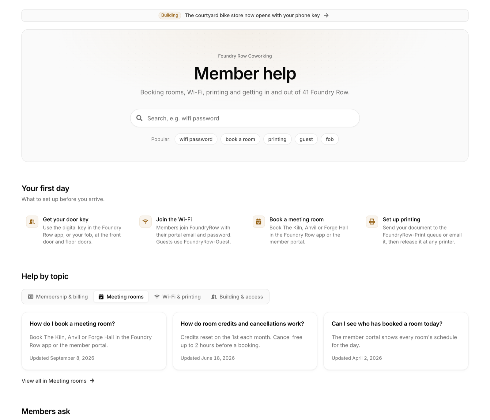
A search hero with a heading, a line under it and popular searches that run when clicked. Under it come the categories, popular articles, recently updated articles and video tutorials, each with its own switch and heading. An announcement line above the hero links to an article, a category, a search or any address. The order of the fixed blocks is a choice of presets, so the page cannot be pulled out of shape.
Home sections
Bands of your own, placed at the top, between the fixed blocks or at the bottom. Each band has a heading, a type, a column count, a card style and an icon style:
Category cards, built from your categories with their article counts.
Article cards and link cards, each pointing at a category, an article, a search or any address, with an optional badge such as Step 1.
Icon list, compact links with an icon each.
Video cards.
Feature banner, an image with a heading, a line of text and a button.
Category
The category's icon, name, description and article count, then its articles grouped by section, in the order you entered them. Tag chips above the list narrow it to the articles with those tags, and a Clear button resets them. The chosen tags are in the address too. The other categories sit in a sidebar, which becomes a menu button on smaller screens.
Article
Breadcrumbs, the title and summary, the updated date, the reading time worked out from the words, and the author. A table of contents built from the headings in the article follows the reader down the page and marks the section in view. Each heading carries a button that copies a link to it. At the foot: Was this helpful?, tags, related articles, the previous and next article in the category, and print and copy-link buttons.
Search
Results appear as the visitor types, grouped by category with the matching words marked. Enter or See all results opens the full results view, with a chip per category to narrow it and a count. When nothing matches, the visitor sees suggested articles and the contact strip.
Layouts
This page shows one setup. Every other one is a choice on the Layout and Pagination groups of the Content tab, and every combination works together.
Home categories
Card grid. A card per category with its icon, description and article count, as on this page. Two, three or four columns, set on Category columns.
Rows. One category per line, full width, with the count and an arrow on the right. Suits a short list of topics.
Sidebar and articles. The categories as a list on the left, the popular articles beside them. Suits documentation, where visitors know what they want.
Tabs, one per category. A tab row with the articles of the chosen category under it, so visitors see answers without leaving the home page.
Tabs, one per category, with raised cards and a warm accent.
Card style and icon style
Card style applies to category cards and article cards: Bordered with a hairline edge, Filled on a muted panel, Elevated with a shadow, or Minimal with the icon and words and no box. Each home section can keep that style or pick its own. Icon style is set per home section: a plain icon, a tinted tile, a circle, or a large tile or image for illustrated cards.
Article lists
Rows. Title, summary, tags and date on each line, as in the categories on this page.
Cards. A grid of cards with the title and summary.
Compact list. Titles only, for long lists of short articles.
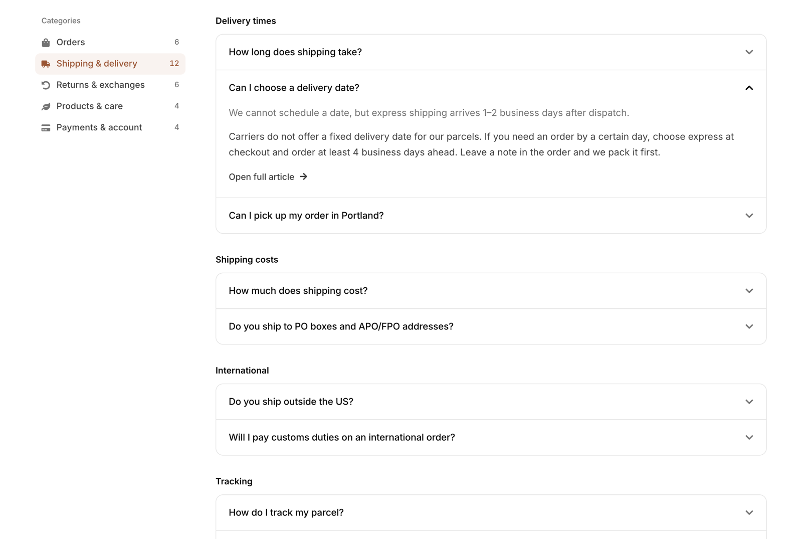
Questions that open in place. Each article is a question that opens its answer under it, like an FAQ page.
Questions that open in place, with a link to the answer on its own view.
Where an article opens
On its own view. The article replaces the list, with the sidebar and table of contents around it, as on this page.
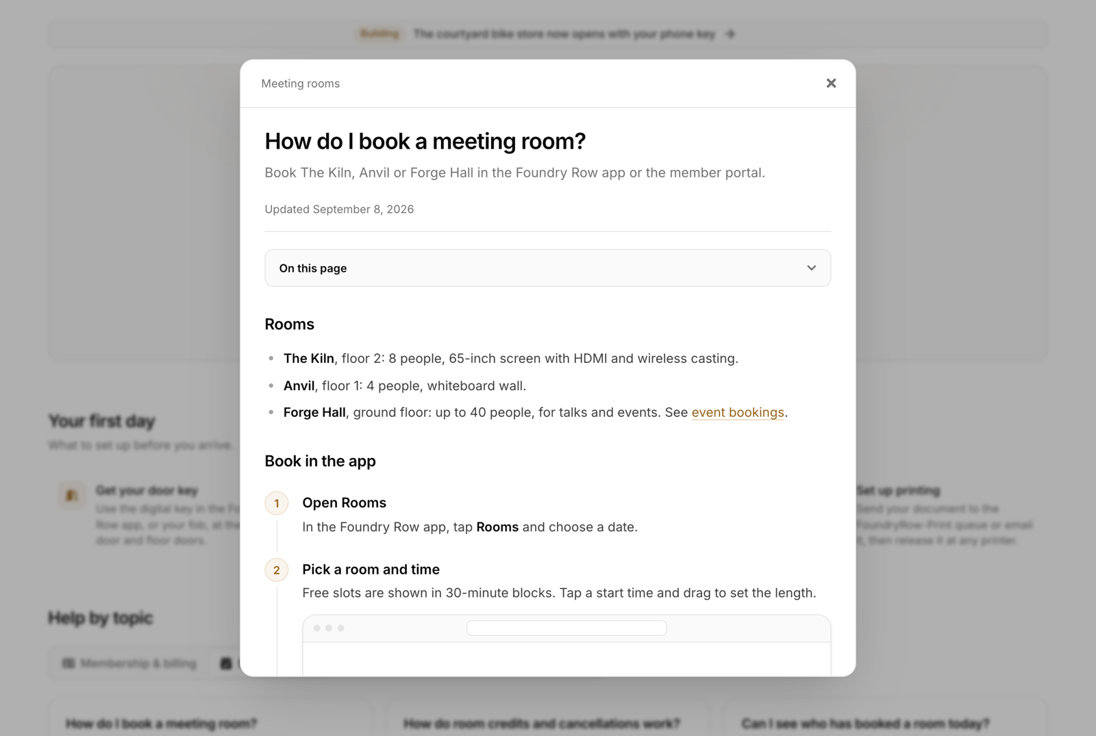
In a pop-up. A dialog over the list, with the table of contents at the top.
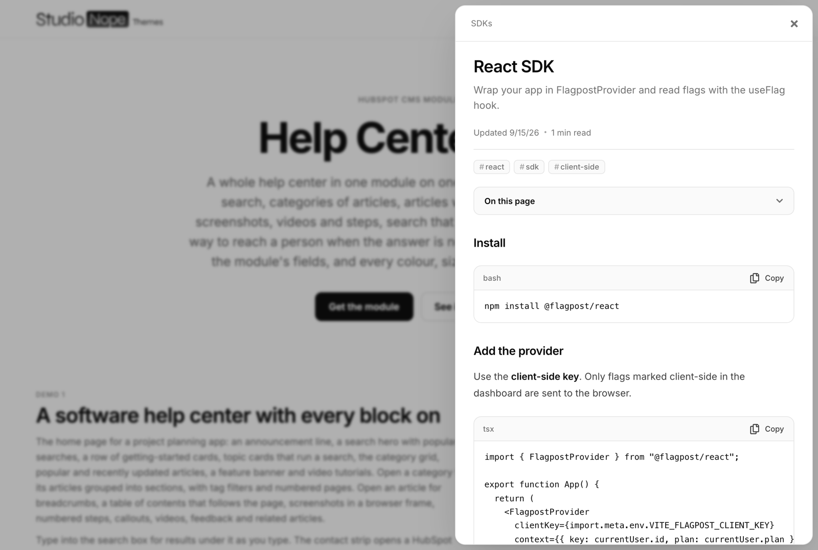
In a side panel. A panel from the right. Its width and whether it floats with a gap around it are fields.
In place, in the list. The answer opens under its question. This choice turns the lists into questions.
An article in a pop-up or a side panel changes the address, so a shared link opens the same pop-up or panel, and closing it puts focus back on the link that opened it. An answer that opens in place leaves the address alone. A link to it opens the answer on a view of its own.
An article in a pop-up, with its table of contents above the text.An article in a side panel, with code blocks that copy in one click.
Search results
Under the search box. A dropdown of results as the visitor types, as on this page.
On a results view. Enter opens a full page of results with category chips and pages.
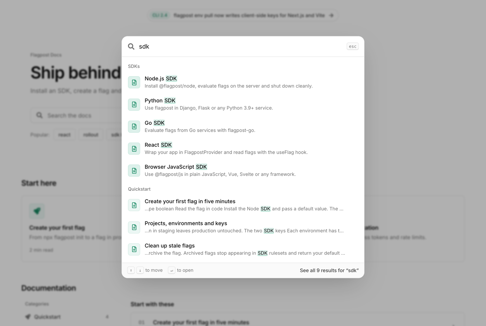
In a search pop-up. A command palette over the page, opened from the search box or with Ctrl K, ⌘ K or /.
The search pop-up, with results grouped by category and keys to move and open.
Sidebar and table of contents
Category sidebar sits on the left, on the right, or is hidden. Below the width on Sidebar becomes a menu below, it turns into a Categories button. On this page sits right of the article, above it, or is hidden, and Contents moves above the article below sets where it moves to the top on narrower screens.
Pagination
A category or a set of search results longer than Items per page is split up in one of three ways: Page numbers, as in the categories on this page, Previous and next, or a Load more button that adds the next set under the ones already shown. The page number is in the address. Keyboard focus moves to the first new article, and screen readers hear which page they are on. The lists on the home page have a count each instead.
Content blocks
An article is a list of blocks in any order. Pick the type on each block and only its fields show.
Text. Rich text. Its headings feed the table of contents.
Image. With a caption, in a browser window frame, a phone frame or no frame. Click to open it full size, unless the lightbox is off.
Video. A HubSpot video, or a YouTube or Vimeo address, with a poster image and a caption. Play opens the video in a player pop-up over the page, with its title and a link to the article, and the page address changes so the video can be shared. The player loads only then, so a page with videos stays light. Video cards open on the Settings group sends video cards to the article instead.
Steps. Numbered for you. Each step has a title, text and an optional screenshot.
Callout. Note, tip, warning or important, each in its own colour and icon, with an optional title.
Code. Code with a language label and a copy button.
Accordion. Questions that open their answers.
Divider. A line between parts of an article.
Search
Search runs in the visitor's browser on an index the page carries with it, so results come back without a request to a server. It looks at titles, summaries, tags, sections, category names and the opening of each article's body, and ranks title matches first. How much of the body it reads is the Article text searched field: more text finds more and makes the page heavier.
Typos. A word with one letter wrong still finds its article. Switch this off with Allow one typo per word.
Words that mean the same. One rule per line on the Synonyms field, such as invoice = bill, receipt. A search for bill then finds the invoice articles.
Keyboard. The arrow keys move through the results, Enter opens one and Escape closes the list. With shortcuts on, / and Ctrl K or ⌘ K jump to the search box, or open the search pop-up. When several help centers share a page, the first one with shortcuts on owns them.
Addresses
Every view has its own address, so a category, an article or a search can be linked, bookmarked and shared: /help?hc-category=billing, /help?hc-article=change-your-plan, /help?hc-q=invoice. The page is built on HubSpot's servers for each address, so every view works with JavaScript off. With JavaScript on, the module swaps views in place after the first load, without reloading the page.
The start of each address is a choice on the Link prefix field, hc by default. Two help centers on one page need a prefix each. Any other parameters on the address are kept, so campaign tags survive a click from one article to the next.
Search engines
Every view shares the page's canonical address, so search engines index the help center as one page and articles do not rank as pages of their own. For articles that need to rank on their own, publish them as pages or blog posts and link to them from a link card. The module writes structured data for the view on screen: BreadcrumbList on categories and articles, TechArticle on articles, and FAQPage on an article with an accordion block. Switch it off on the Settings group if another tool writes it for you.
The contact strip
A Still need help? band. With a form, it has two columns: a heading, a line of text, up to four contact cards such as support hours, reply time, email and community, a row of team faces with a status line, and a HubSpot form in a card of its own. Every one of those parts is optional. With buttons only, it becomes a single row with details as small pills and one or two buttons. It shows on every view, on the home page only or on articles only, and always on a search that finds nothing. The form sits in the band, or opens in a dialog or a side panel.
Forms built in HubSpot's legacy form editor take the module's styling. Forms built in HubSpot's new form editor render in an iframe with the styling set in that editor.
When a search finds nothing, the words the visitor searched for are typed into the form field you name on Put the search words in this form field, so the question arrives with the message. Leave the form empty and the buttons show alone.
Was this helpful?
Yes and No buttons at the foot of every article. After a No, the visitor sees a line of text you write, a HubSpot form, or nothing. On this page a No opens the same form as the contact strip. The module stores no votes. Each vote is sent to Tag Manager and to your own scripts, described under Tracking.
Tracking
Each search pushes an event named hc_search to the dataLayer for Google Tag Manager, carrying search_term, results and zero_results. A search that finds nothing is the list of articles you have not written yet. Each vote pushes hc_feedback, carrying article, article_title, category and helpful. Both names are fields on the Tracking group. The module also dispatches helpcenterpro:search and helpcenterpro:feedback on the page, with the same values, for any script of your own. A search is counted once the visitor stops typing.
Colours and style
Every colour, font, size, weight, radius, space, width and duration is a field on the Style tab. Colour fields carry opacity as well as a colour, and both are used.
Taken from your theme
The body font, the heading font, the accent, tints 1 and 2, the focus ring, the search highlight and the note callout inherit from your HubSpot theme settings. Dropped on a page, the help center already uses your brand colour and your fonts. Change any of them on the module and that instance keeps its own value.
The accent and its tints
The accent colours links, the current category, the current section in the table of contents and selected chips. Accent text depth darkens it for text, so accent words stay readable on white. Tints 1 to 4 are pale washes for icon tiles. Each category picks Neutral or one of the four tints, which keeps every card in your palette with no colour picked card by card. Tints 1 and 2 follow the accent. Tints 3 and 4 are grey and stone to begin with.
What each group changes
Group
What it changes
Typography
Body, heading and code fonts, sizes for the hero, page titles, article headings, card titles, article text, controls and small print, with their phone sizes, weights, line heights and heading letter spacing
Colours
Accent and tints, background, cards and panels, hover and pressed states, text in four strengths, borders, the pop-up backdrop, the focus ring, the search highlight, buttons, each callout type, the video badge and play button, and the shadow colour
Shape
Radius of cards, the search box, buttons, icon tiles, menu items and pop-ups, and the border width
Layout
Maximum width, side and top padding on desktop and phones, spacing unit, space between sections, gaps, card padding, category columns, sidebar and contents widths, article width and the sticky offset
Search hero
No background, a tint or an image with a veil, the dot pattern, a frame, centre or left alignment, padding and the search box width
Components
Hero search size, chip shape, card shadow, button height, icon tile and icon sizes, segmented or underlined tabs, a pill or full-width announcement, pop-up and side panel widths, and the height of the search dropdown
Motion
The easing curve and the speeds for hover, open and close, and pop-ups
Breakpoints
Where the contents move above the article, where the sidebar becomes a menu, and where the phone layout starts
Every word visitors see or hear is a field on the Words group, and every icon on the Interface icons group, so the help center can be translated in full.
Which setup should I use
A page of frequently asked questions
Home categories as Rows, articles opening In place, in the list, and Load more button for pages. Switch off the table of contents, the reading time, the author, related articles and previous and next. Each question is an article with a one-line summary and the answer as a text block.
A help center for a software product
The setup on this page: a Card grid of categories, Rows for lists, articles On their own view, results Under the search box, the sidebar on the left and the contents on the right. Add a getting-started home section with step badges, mark your most-read articles as popular and put a form in the contact strip.
Developer documentation
Sidebar and articles on the home page, a Compact list, articles In a side panel and search In a search pop-up with shortcuts on. Previous and next suits reading in order. Use code blocks with a language label, and synonyms for the words developers search with, such as token = key, secret.
A small business
Tabs, one per category on the home page, Cards for lists and articles In a pop-up, so visitors never leave the home page. A handful of categories with a few articles each is enough. Put your opening hours and address in the contact strip details.
What it looks like before you touch anything
Dropped onto a page, the module shows a help center for a sample product: a search hero on a pale tint, category cards with icons, popular and recent articles and a contact strip with buttons. Articles open in their own view with a table of contents on the right. Fonts and the accent colour come from your HubSpot theme settings, so the section already matches the page around it. In the editor, Show in the editor picks which view you see while you edit: the home page, the first category, the first article or search results.
Accessibility
The search box follows the combobox pattern, so screen readers hear the number of results and the one in focus. After a search or a filter change, the number of results is read out. The current category and the section in view in the table of contents are marked as current. Dialogs and panels hold focus while open, close on Escape and return focus to what opened them. Numbered steps and callouts carry their number and type in words. Buttons that open a new tab say so. Heading levels start at H1 or H2, a field, so the module fits a page that already has its own H1. Every control shows a focus ring in a colour you set.
Reduced motion
A visitor whose device asks for less motion gets dialogs, panels and lists that open without movement, and a table of contents that jumps to a heading without scrolling to it. That follows the visitor's own setting, so it cannot be switched off from the editor.
Troubleshooting
A link from a card goes to the home page. Its web-address name does not match a category or an article. Copy the name from the address bar of the article itself. In the editor the card carries a note saying so, which visitors never see.
Two help centers on one page open each other's articles. Give each its own Link prefix.
A video shows its poster with no play button. The block has no video picked or no address. Check the address is a YouTube or Vimeo link.
The form does not take the search words. The name on Put the search words in this form field has to be the internal name of a field on the form, such as message.
A search misses words deep in an article. Raise Article text searched on the Search group.
The help center does not line up with the rest of the page. Set Maximum width and Side padding on the Style tab's Layout group to your page's container width and gutter.
The table of contents does not stay in view. An element around the module has overflow: hidden, which stops anything inside it from sticking. Move the module out of that wrapper.
The page takes a moment to open a new article address. Each address is built on the server the first time it is asked for. Views opened from inside the help center swap in place and do not wait for that.
Notes on this page
One instance of the module, on the same container as the text above it. Planyard, its articles and its screenshots are made up for the demo. The email and community cards go nowhere, and the form under Still need help? is a real HubSpot form on this site. The pictures under Layouts come from the same module with other field values.
The videos are placeholders: public tutorials from YouTube chosen to match each article's subject, standing in for the product's own recordings. No CSS on this page touches the module.