An event listing that sorts itself. Upcoming and past tabs read the visitor's own date, category filters build themselves from your data, and grid, list and overlay layouts all come from the same rows. Colour, type and spacing are editor fields.
The default layout, monochrome out of the box. Category chips are built from the event data, the search box matches as you type, and the tabs split the same rows into upcoming and past. Three of these events are dated in the recent past, so the faded past treatment and the recording label are visible under the Past tab.
Workshops, webinars and two conferences. Filter by category, search the programme, or switch to the past tab for recordings.

A working session on component governance, versioning and the review process that keeps a shared library from drifting once more than a handful of teams depend on it.
Drop-in session. Bring a migration you are stuck on.

How editorial calendars, review queues and localisation fit together once volume goes past what a spreadsheet can hold.

Two days of talks, workshops and a hallway track. The full programme is published four weeks ahead.
Bring a page. We audit it live against WCAG 2.2 AA and leave you with a written list of fixes ordered by severity.

Practical instrumentation for small teams: what to track, what to ignore, and how to keep the event schema from rotting.
Short talks and a long break in the middle. No badges, no booths.
Positioning, tiers and the migration plan for existing customers. Half the session is spent on the plan nobody writes down.
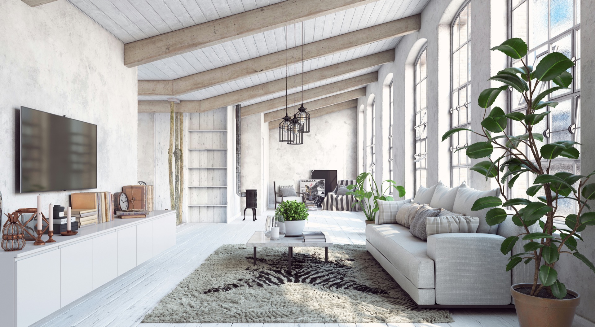
Six sessions over three weeks, ending with a practical assessment. Cohorts are capped so the exercises stay reviewable.
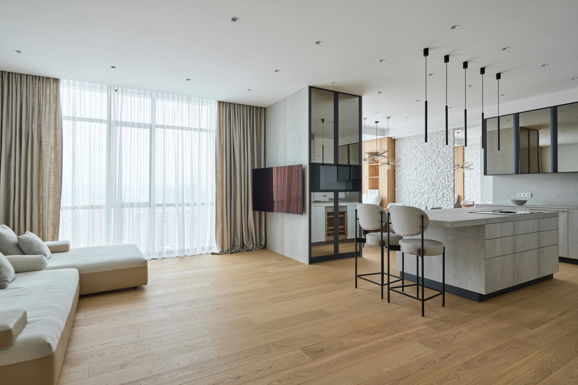
What shipped, what slipped, and what the next two quarters look like.
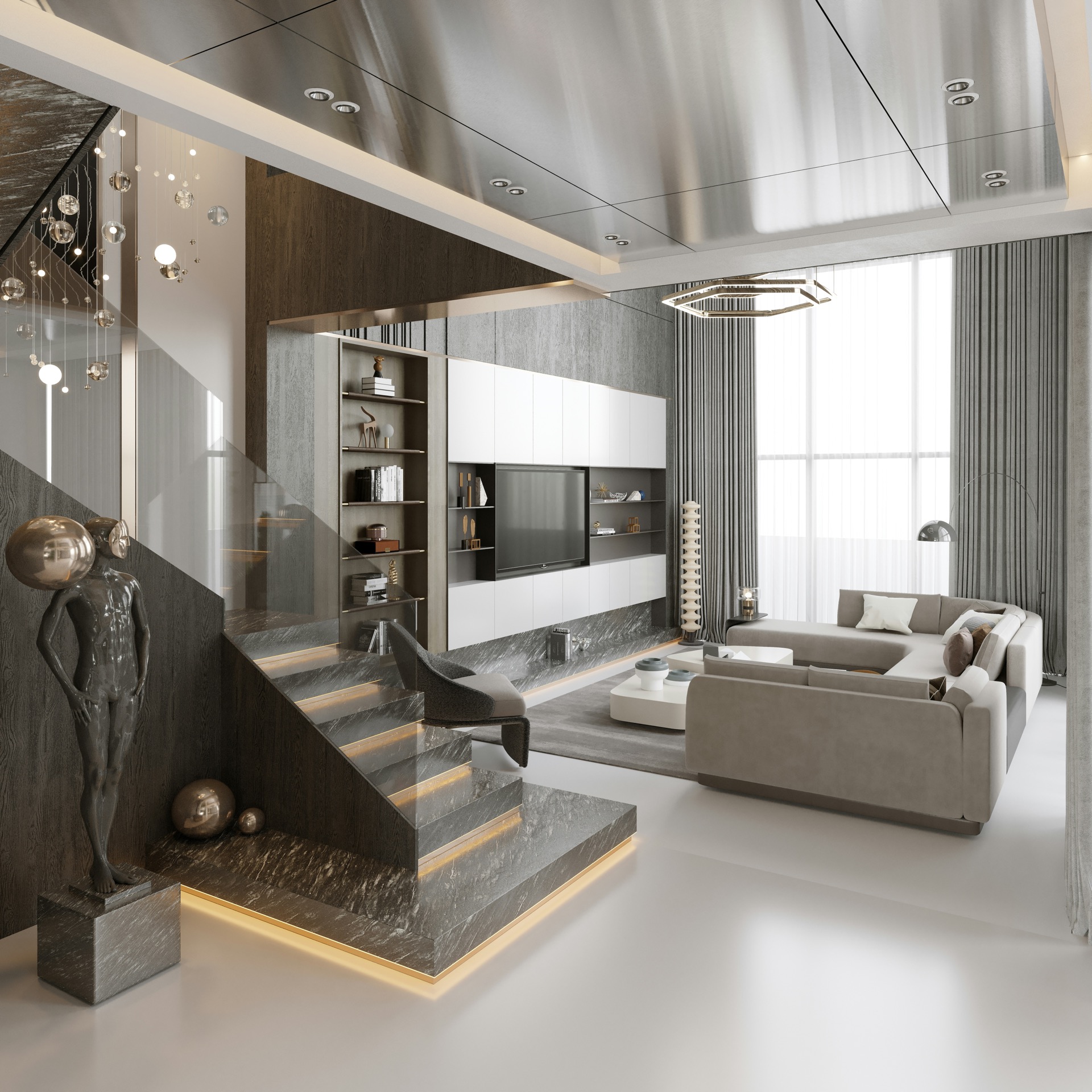
A recorded workshop on interview design, sample size, and reporting findings so they survive contact with a roadmap.
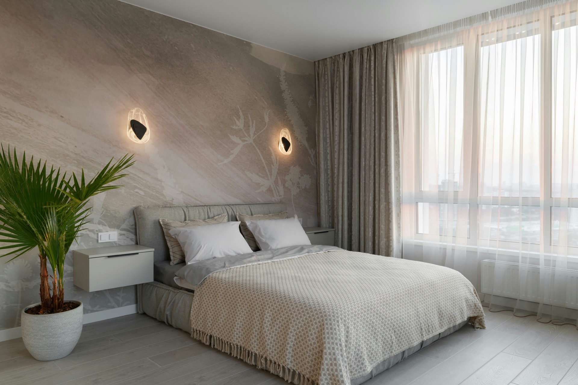
The opening talk from the last edition, now public.
Nothing matches that filter yet.
The same module in list view. Image on the left, a button call to action instead of a text link, no search box, and the tab defaults to everything so upcoming and past sit in one stream, upcoming first.
An open call. Anyone can add an item to the agenda up to two days before.
Two hours on ranking signals, synonym handling and how to run an offline evaluation before you touch production.
Agenda, sessions and the evening dinner. Invitation required.
The first ninety days: permissions, naming conventions, and the settings that are painful to change later.
Working with translators, handling plural rules, and keeping a growing string catalogue reviewable across eleven languages.
Definitions, lineage and the paperwork finance will ask for.
Recorded. Release notes and the migration guide are linked from the recording.
Setting a budget, wiring it into CI, and deciding what happens when a build breaks it.
No events in that category.
Overlay view. Text sits on the image, descriptions are off, and the toolbar is stripped back to the two tabs. Overlay strength and blur are fields, so the same set of photographs can be made lighter or heavier without new assets.
No events scheduled.
Nothing here is a different module and nothing here is custom CSS. The dark ground, the serif headings, the square corners, the gold accent and the taller images are all field values on this one instance. Past events are switched off as well, so the two archived rows in the data never render and no past tab appears.
Private views, atelier mornings and salon conversations. Past events are switched off on this instance, so the two archived entries in the data never render and no past tab appears.
An evening walkthrough with the design team, followed by dinner.
Three hours at the bench with the finishing team. Twelve places.
A conversation between two designers on restraint, materials and the rooms people live in.
Bring a brief. We work through scope, timeline and the parts that usually go wrong.
Two evenings of new work, open to clients and to the trade.
Where a palette goes once the neutrals are exhausted.
A short talk on the archive and what is being brought back.
Recorded from the spring series.
Nothing in that strand this season.
Every event is one row in the Events repeater. Only the title and date are required. In a grid, give every event an image or none of them one: a row that mixes the two leaves space under the shorter cards. The list layout takes a mix without a gap.
| Field | What it does |
|---|---|
| Date | Format YYYY-MM-DD. This is what sorts the list and decides whether an event counts as upcoming or past. |
| End date | Optional. Set it for a multi-day event and the card shows a range. A multi-day event stays upcoming until its end date has passed. |
| Time | Free text, shown next to the date. Write it however your audience reads times. |
| Location type | Virtual, in-person or hybrid. Drives the icon and the location badge. |
| Category | Free text. The category filter row is built from whatever categories you use, so there is no second list to maintain. |
| Featured | Outlines the card. Use it for the one event you want people to land on. |
The module compares each event date against the visitor's own date. Nothing is baked in at publish time, so a listing keeps sorting itself as dates pass.
Show past events. Past events then stop rendering entirely and the tab disappears, which is what the fourth demo above does.Past event CTA text, so a registration link becomes a recording link without editing each row.Three layouts, set per instance under Default view:
Turn on Show view toggle and visitors can switch between the grid and list themselves.
The category row appears once two or more categories exist in the data. Search matches titles, categories and card text as you type. Both are optional per instance.
When a filter or a search returns nothing, the empty-state message appears in place of the grid. Its wording is a field, so it can be translated or made specific to the listing.
Set Card click action to drawer and clicking a card opens a panel with the long description, the full date, time, format, location, category and speakers. Set it to link and the whole card becomes the registration link instead. Set it to none and only the call to action is clickable.
Colour, type, radius, border, shadow, badge padding, card padding, gaps, section padding and both breakpoints are editor fields on the style tab. The module ships monochrome and inherits your theme's colour and font settings where you leave a field on inherit. Nothing is hardcoded, so a listing can be restyled without touching the template.
Tabs, filters, the view toggle and the drawer are keyboard operable with visible focus rings. The drawer closes on Escape. Every image takes alt text from its row. Motion respects prefers-reduced-motion.
