Cards of files to download, in a grid or a list, with a search box, category pills and a file type menu. A card with one file gets a button. A card with several opens into a menu or a list. File types and sizes are read from the files themselves, and every colour, size and word is a field.
Demo 1
The list layout: an icon on the left, the words in the middle, the button on the right. The rate card and the logo pack are one file each, so their button says what the file is and how big it is. The media kit and the audience data come in two formats, so their button opens a list inside the row. The type comes from the file name and the size from the file.
Demo 2
A grid of covers with every filter switched on. The search box matches titles, descriptions, categories and file names as you type. The pills come from the categories on the cards, and the menu beside the search box lists only the file types in the library. Six cards show first and Show more brings in the rest. A card with two files opens a small menu under its button.
Fernline library
The documents we use with clients, free to download and use with your own team.
Templates
The brief to fill in before a redesign starts, so the first meeting is about decisions.
Reports New
What worked across forty client accounts this quarter, channel by channel.
Checklists
The list we run through in the week before a site goes live.
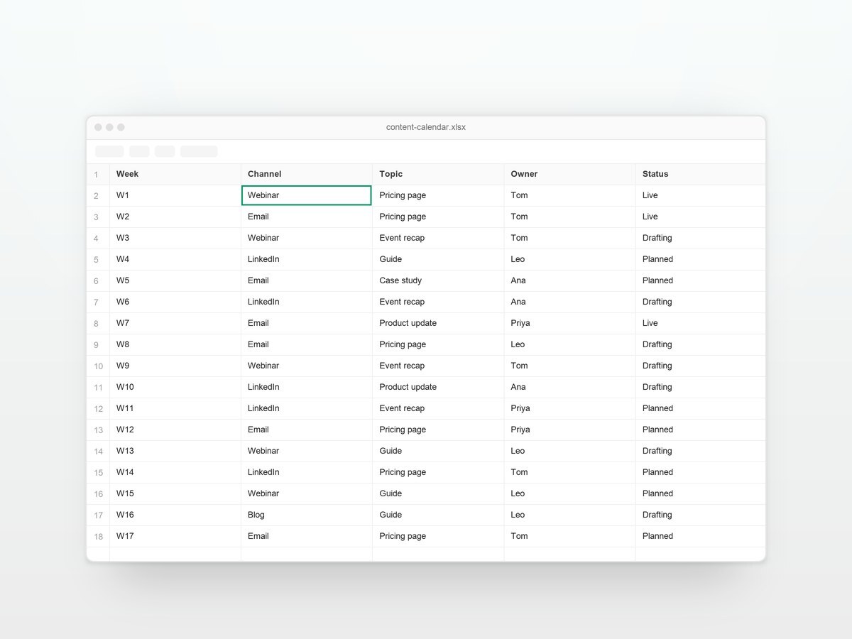
Templates
Twenty-six weeks of slots for posts, emails and events, with an owner for each.
Guides
How a whole team writes in one voice, with examples to copy.
Templates
Eight slides for the quarterly board update, with the charts already laid out.
Checklists
Every check in the audit, in the order we run them.
Reports Updated
Open, click and unsubscribe rates by industry, from this year's sends.
Guides
What happens in the first thirty days of working together, week by week.
Nothing in the library matches that.
Demo 3
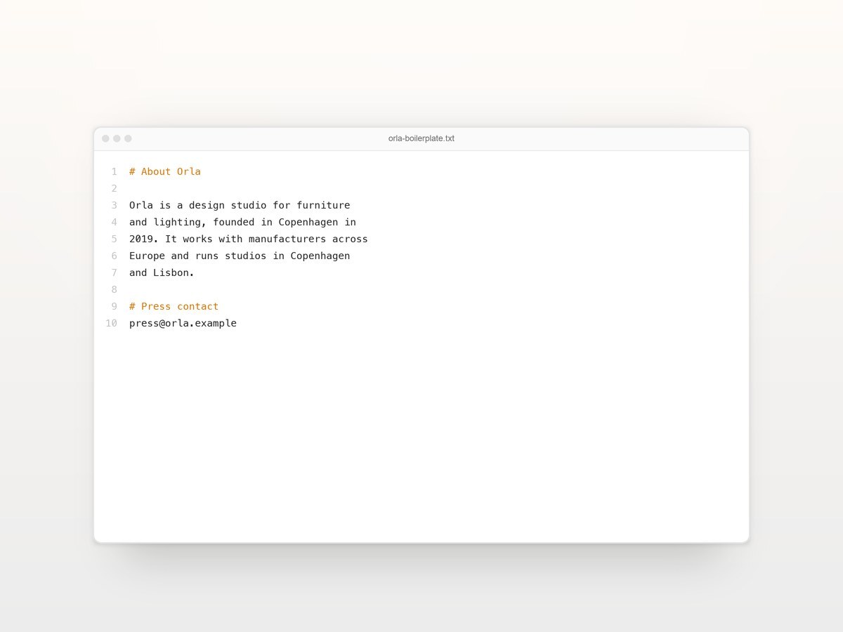
The file lists are set to always open, so a journalist sees every format without pressing anything. Each file type carries its own icon: the logo pack is an archive, the portrait is an image, the release is a Word document and the boilerplate is plain text. The selected pill takes a light tint of the accent in place of the dark default, and the search box is off.
Press
Logos, photography and the latest release. Use them freely in coverage of Orla.
Brand
The mark in dark, light and amber, for any background.
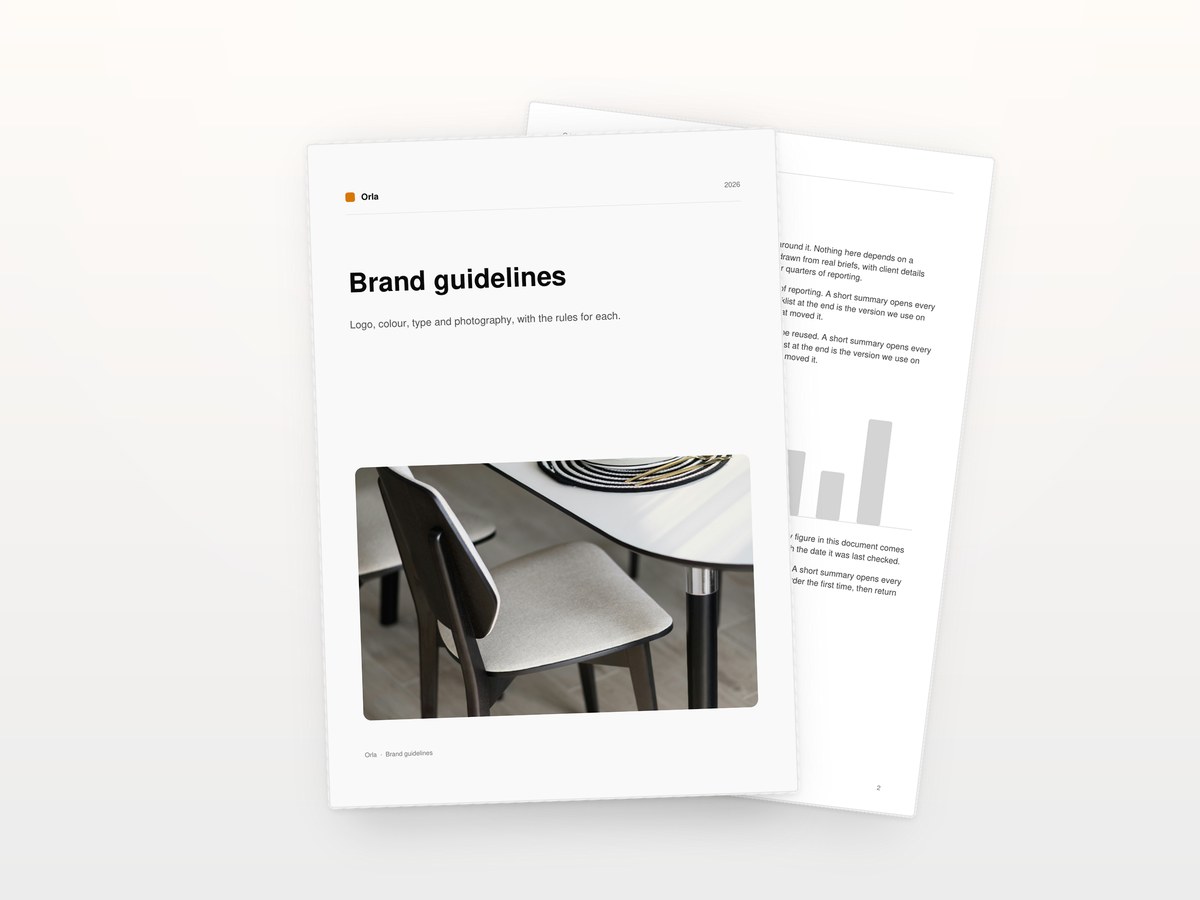
Brand
Logo, colour, type and photography, with the rules for each.

Photography
The founder, the Copenhagen studio and the workshop. Credit Orla.
Releases Embargoed
The September release on the Lisbon studio, with quotes from both founders.
Releases
Founded, team, locations and the people to call.
Releases
The paragraph about Orla to paste at the end of an article.
Nothing here yet.
Demo 4
Rows with square thumbnails and outline buttons, a search box, a file type menu and the switch between list and grid in the corner. The bundle card holds four files and opens a menu, which flips upward when there is no room below it. The firmware card mixes a file with a link to a page elsewhere, which opens in a new tab and carries its own icon.
Support
Data sheets, installation guides and CAD files for the K2 sensor and the K4 gateway.
Data sheets Rev. C
Dimensions, power, radio and certification for the K2 sensor.
Guides Rev. B
Mounting, wiring and first power-on, step by step, with torque values.
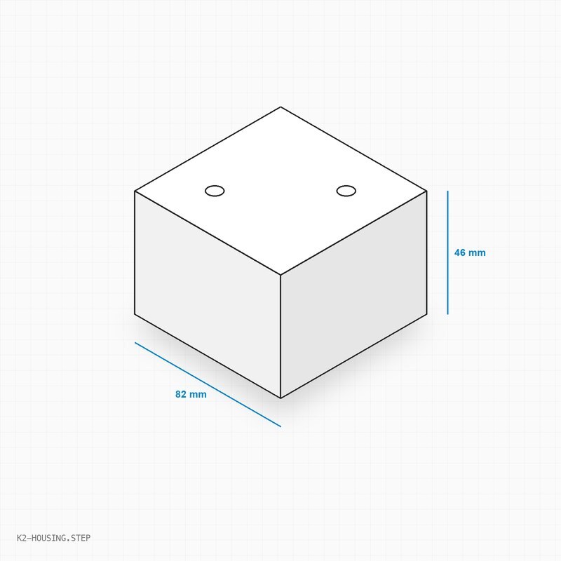
CAD
STEP model of the housing and a DXF of the mounting bracket.
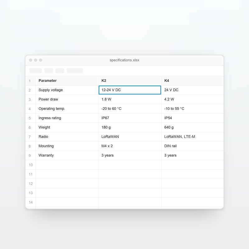
Data sheets
Both devices side by side in one sheet, parameter by parameter.
Guides
The data sheet, the installation guide, the warranty and the CAD files together.
Data sheets Rev. A
Dimensions, power, radio and certification for the K4 gateway.
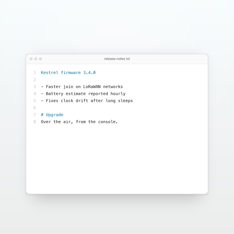
Firmware Latest
Faster network join, hourly battery reports and a fix for clock drift.
No document matches that search.
A download section for HubSpot CMS. Each card carries a title, a description, an icon or an image, and one or more files from your File Manager. Visitors search the cards, narrow them by category and by file type, and download a file with a single click. The file arrives on their device under the name you gave it.
Cards are a repeater, and each card holds its own repeater of files. Per card:
| Field | What it does |
|---|---|
| Card picture | An icon from HubSpot's icon picker, an image, or nothing |
| Title, Description | The words on the card. Both are searched |
| Category | Groups the card under a filter pill |
| Badge | A short word beside the category, such as New |
| Small print | A line under the description, such as a date or a revision |
| Button text for this card | Replaces the button text for this card only |
| Files | The files on the card, each with a name, the file, an optional link, a type and an optional size |
A file is picked from your File Manager. When a document lives somewhere else, leave the file empty and paste the address into Or a link: it opens in a new tab and carries the Link icon in place of the download arrow. A card whose only file is a link gets a button that reads Open, set on Button text for a link.
A card with one file gets one button, which reads Download PDF, or whatever your button text is, followed by the type and the size. A card with several files gets a button that reads Download · 3 files, and what that button opens is chosen on a field:
Each is a switch on the Search and filters group.
cafe finds café.Guides and guides are one pill. The row is left out when every card shares one category.When nothing matches, the grid gives way to a message and a button that clears every filter. Both are words you set.
Set Cards shown before Show more above 0 and the section opens with that many cards and a button under them that brings in the next set. Filters count every card, including the ones not shown yet, and a new search starts back at the first set. Keyboard focus moves to the first card that arrived.
Grid of cards. A column count for desktop, tablet and phone. An image can run to the card edges or sit inside the padding, cropped to the shape you choose, and the button sits on the bottom edge so buttons line up across a row.
List of rows. One card per row with the picture on the left, the words in the middle and the button on the right. On a phone the button moves under the words and runs the full width.
The type is read from the end of the file name, so media-kit.pdf shows as PDF. Set it on the File type field when a file name does not say what the file is. Each type has its own icon in the file list: PDF, Word, Excel, PowerPoint, archive, image, audio, video, code and text.
The size is read from the file when its card comes near the screen, written in the units on the Size units field, with the number written the way the page language writes it, so a German page shows 2,4 MB. Type a size into File size to show that instead. Switch sizes off and the module sends no request for them.
Files from your own File Manager are served from your own website's address, which lets the browser save the file under the name you gave it instead of opening it in a tab. A PDF downloads as a PDF. The extension is added to the name for you.
A file from another HubSpot portal or another address is fetched by the page and saved under its name, with the button marked busy while that happens. If the fetch fails or takes longer than twenty seconds, the file opens in a new tab, so a click never does nothing and the page stays where it was. A file known to be larger than 50 MB is handed straight to the browser. A visitor who holds Command or Ctrl while clicking gets the browser's own behaviour.
Every download pushes an event to the dataLayer for Google Tag Manager, named file_download unless you change it, carrying file_name, file_type, file_url and card_title. In Tag Manager, add a Custom Event trigger with that event name and read the four values as Data Layer Variables. The section also dispatches a downloadcenterpro:download event on the page, with the same four values, for any script of your own. A double click counts as one download. Switch the dataLayer event off on the Tracking group.
file_download is also an event GA4 records by itself when enhanced measurement is on. If a GA4 tag in Tag Manager forwards this event under the same name, a download can be counted twice, so a name of your own, such as resource_download, is the safer choice.
Dropped onto a page, the module shows a heading, a search box, category pills and a grid of three cards to a row on white. Each card has a hairline border, an icon on a pale tile tinted with your theme's primary colour, a category, a title, a description and a compact dark button. Cards with two files open a small menu. The fonts and the accent colour come from your HubSpot theme settings, so the section already matches the page around it.
The search box and the file type menu carry labels for screen readers. Pills are buttons that report whether they are pressed. Every download button names the card it belongs to, so a screen reader hears Download PDF: Launch checklist and not a list of identical buttons. The order is a field, Screen reader: button with its card. A link that opens a new tab says so. A button that opens a file list reports whether it is open and which list it controls. Escape closes an open list and returns focus to its button. After every search or filter change the number of matching cards is read out, or the nothing-found message when there are none, whether or not the count is shown. A file being fetched keeps its name while it is marked busy. Focus rings are visible on every control and take their colour from a field.
A visitor whose device asks for less motion gets the cards already in place, no fade-in, no lift on hover and menus that open without travel. That follows the visitor's own setting, so it cannot be switched off from the editor.
Every colour, size, weight, radius, space, duration and easing is a field on the Style tab, grouped by what it affects: fonts, section, section heading, search and filters, cards, card icon, card text, download button, file list, motion and breakpoints. Colour fields carry opacity as well as a colour, and both are used. Body font, heading font and the accent colours inherit from your HubSpot theme settings. The button comes filled, outlined or as text with an icon. Every word visitors see or hear is a field on the Words group, so the section can be translated in full.
overflow: hidden. Move the module out of that wrapper, or switch Cards with several files to a list inside the card.Four instances of one module, differing only in field values, each on the same container as the text above it: a media kit as rows with lists that open inside the row, a searchable library with Show more, a press kit with every file on show, and product documents with thumbnails, a layout switch and a menu that opens upward. Every file on this page is a real document you can download and open. No CSS on this page touches the module.